silverwind
27c221aa5d
Rework notifications list ( #24812 )
...
- Replace `<table>` with flexbox
- Add issue modification time and issue number
- Remove big title
- Replace tabs with menu items
- Add clicked item deletion on back button cache restoration

---------

Co-authored-by: wxiaoguang <wxiaoguang@gmail.com>
2023-05-25 02:31:26 +00:00
silverwind
1fd7e3d6be
Improve Actions CSS ( #24864 )
...
- Various color tweaks
- Add sticky positioning to left sidebar, right header and right step
header
- Adjust margins and border radiuses
<img width="1235" alt="Screenshot 2023-05-23 at 11 18 06"
src="https://github.com/go-gitea/gitea/assets/115237/f601b00d-c7f2-43de-89f2-3ac55f2d9cdc ">
<img width="1239" alt="Screenshot 2023-05-23 at 11 18 18"
src="https://github.com/go-gitea/gitea/assets/115237/a2d24cc9-29fa-4c17-906b-84feea14b889 ">

---------
Co-authored-by: yp05327 <576951401@qq.com>
2023-05-24 09:00:29 +00:00
silverwind
64e0672e3b
Fix @font-face overrides ( #24855 )
...
Fixes: https://github.com/go-gitea/gitea/issues/24850
Not sure how to do it for asian fonts only, so let's revert to previous
value for now.
### Before
<img width="414" alt="Screenshot 2023-05-22 at 10 34 10"
src="https://github.com/go-gitea/gitea/assets/115237/749f1556-a5cf-48fe-8b10-8dc447221657 ">
### After
<img width="416" alt="Screenshot 2023-05-22 at 10 34 04"
src="https://github.com/go-gitea/gitea/assets/115237/a0a315bb-d95f-4d03-863e-0534f665ca71 ">
2023-05-24 01:48:51 +00:00
wxiaoguang
bb9e20e434
Fix document and improve comment ( #24844 )
...
* Fix broken doc link:
https://github.com/go-gitea/gitea/actions/runs/5041309438/jobs/9040887385
* Improve comments about how font weight works:
https://github.com/go-gitea/gitea/pull/24827#pullrequestreview-1435584800

---------

Co-authored-by: silverwind <me@silverwind.io>
2023-05-22 08:47:33 +00:00
HesterG
da461b5a08
Improvements for action detail page ( #24718 )
...
Close #24625
Main changes:
1. For the left panel, show rerun icon only on hover, and add style when
the job is selected, and removed icon on the "rerun all" button and
modify the text on the button
https://github.com/go-gitea/gitea/assets/17645053/cc437a17-d2e9-4f1b-a8cf-f56e53962767
2. Adjust fonts, and add on hover effects to the log lines. And add
loading effect when the job is done and the job step log is expanded for
the first time. (With reference to github)
https://github.com/go-gitea/gitea/assets/17645053/2808d77d-f402-4fb0-8819-7aa0a018cf0c
3. Add `gt-ellipsis` to `step-summary-msg` and `job-brief-name`
<img width="898" alt="ellipsis"
src="https://github.com/go-gitea/gitea/assets/17645053/e2fb7049-3125-4252-970d-15b0751febc7 ">
4. Fixed
https://github.com/go-gitea/gitea/issues/24625#issuecomment-1541380010
by adding explicit conditions to `ActionRunStatus.vue` and `status.tmpl`
5. Adjust some css styles
---------
Co-authored-by: silverwind <me@silverwind.io>
2023-05-22 12:17:24 +08:00
silverwind
19993d8814
Change --font-weight-bold to --font-weight-semibold and 600 value, introduce new font weight variables ( #24827 )
...
There was some recent discussion about this in Discord `ui-design`
channel and the conclusion was that
https://github.com/go-gitea/gitea/issues/24305 should have fixed their
OS font installation to have semibold weights.

I have now tested this 601 weight on a Windows 10 machine on Firefox
myself, and I immediately noticed that bold was excessivly bold and
rendering as 700 because browsers are biased towards bolder fonts. So
revert this back to the previous value.
2023-05-21 23:37:32 +00:00
Brecht Van Lommel
268d121f4b
Fix video width overflow in markdown, and other changes to match img ( #24834 )
...
This change makes the CSS for `<video>` in markup match that of `<img>`,
and also allows additional attributes to be used. This way the width,
padding, alignment should work equally well for both.
2023-05-21 21:19:37 +00:00
delvh
e95b42e187
Improve accessibility when (re-)viewing files ( #24817 )
...
Visually, nothing should have changed.
Changes include
- Convert most `<a [no href]>` to `<button>` when (re-)viewing files:
- `<a [no href]>` are, by HTML definition, not a link and hence cannot
be focused
- `<a class="ui button">` can now be clicked (again?) using
<kbd>Enter</kbd>
- Previously, the installed keypress handler on `.ui.button` elements
disabled it for links somehow
- The `(un)escape file`, the `expand section` and the `expand/collapse
file` buttons can now be focused (and subsequently clicked using only
the keyboard)
- You can now press <kbd>Space</kbd> on a focused `View file` checkbox
to mark the file as viewed.
- previously, this was impossible as this checkbox listened on the wrong
event listener

The `add code comment` button has been left inaccessible for now as it
requires quite a bit of extra logic so that it is unhidden when it is
focused (you can otherwise focus it without seeing it as you are not
hovering on the corresponding line).

---------

Co-authored-by: silverwind <me@silverwind.io>
2023-05-21 20:47:41 +00:00
silverwind
32d9c47ec7
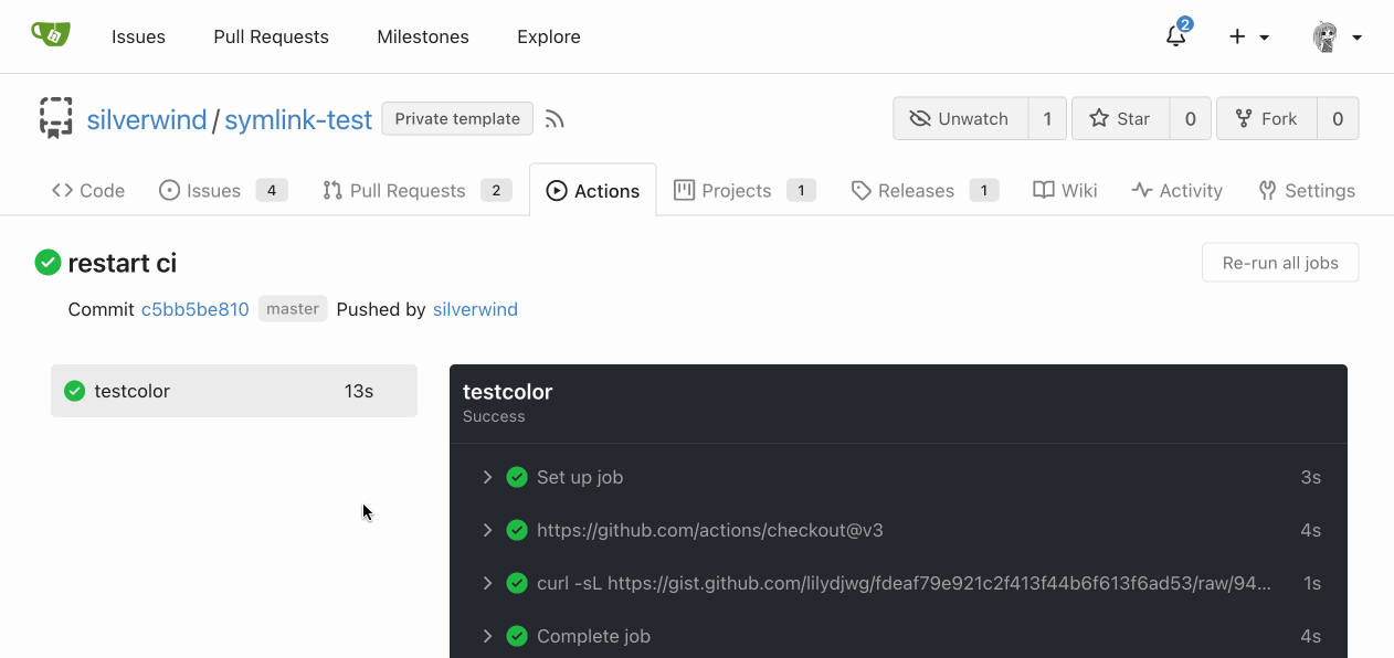
Add RTL rendering support to Markdown ( #24816 )
...
Support RTL content in Markdown:
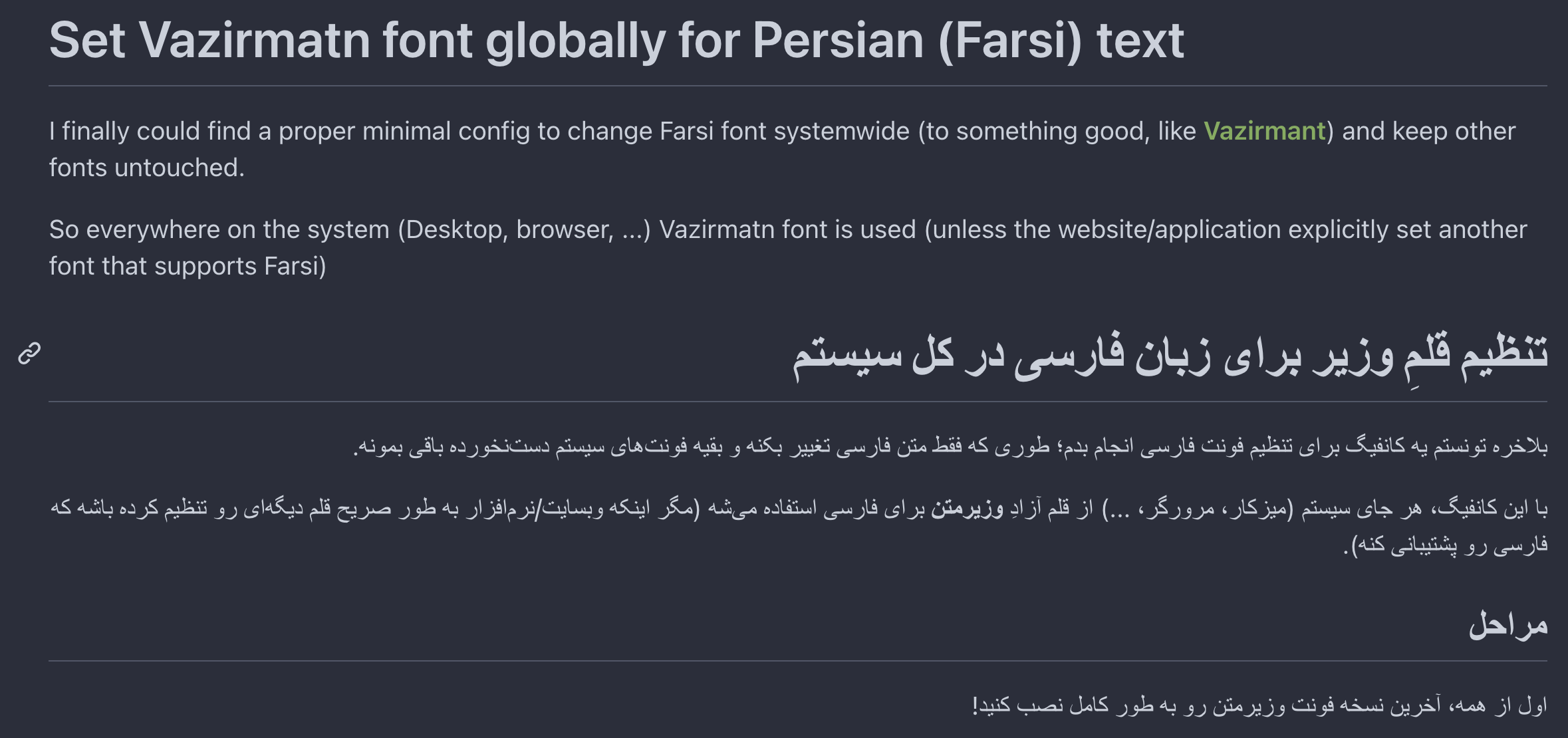
Example document:
https://try.gitea.io/silverwind/symlink-test/src/branch/master/bidi-text.md
Same on GitHub:
https://github.com/silverwind/symlink-test/blob/master/bidi-text.md
`dir=auto` enables a browser heuristic that sets the text direction
automatically. It is the only way to get automatic text direction.
Ref: https://codeberg.org/Codeberg/Community/issues/1021
---------
Co-authored-by: wxiaoguang <wxiaoguang@gmail.com>
2023-05-20 23:02:52 +02:00
silverwind
a103b79f60
Rework label colors ( #24790 )
...
Introduce `--color-label-fg`, `--color-label-bg` and
`--color-label-hover-bg`, decoupling the label styles from other color
variables. I've set the colors so that non-interactive labels like on
tabs are dark-on-light on light theme, which imho looks better than
previous light-on-dark.
In the screenshot below, the leftmost label has hover, the second one
has active.
<img width="786" alt="Screenshot 2023-05-18 at 12 48 26"
src="https://github.com/go-gitea/gitea/assets/115237/d989bb68-504a-4406-b5f6-419ed9609f90 ">
<img width="789" alt="Screenshot 2023-05-18 at 13 04 07"
src="https://github.com/go-gitea/gitea/assets/115237/689a281a-a2b7-45e8-a5ee-dafb7a35e105 ">
---------
Co-authored-by: Giteabot <teabot@gitea.io>
2023-05-19 16:30:24 +00:00
HesterG
acde12a8a2
Fix max width and margin of comment box on conversation page ( #24809 )
...
Fix regression from #23937
The changes should only be limited to `.conversation-holder
.comment-code-cloud`, otherwise it will affect the `.comment-code-cloud`
in conversation tab
Before:
<img width="962" alt="Screen Shot 2023-05-19 at 18 22 25"
src="https://github.com/go-gitea/gitea/assets/17645053/0db01d04-2581-48f9-b46c-497836b1f12b ">
After:
<img width="997" alt="Screen Shot 2023-05-19 at 18 35 01"
src="https://github.com/go-gitea/gitea/assets/17645053/5d14b67b-88c1-46c6-b859-fd41752b3ebb ">
---------
Co-authored-by: Giteabot <teabot@gitea.io>
2023-05-19 16:02:34 +00:00
silverwind
1e1e8b5d43
Fix OAuth loading state ( #24788 )
...
Fix regression from https://github.com/go-gitea/gitea/pull/24740 where
the loading state was not showing because the `oauth-login-image` class
was removed. Replaced the Fomantic loader with a pure CSS loader and
cleaned up the HTML.
Diff:
https://github.com/go-gitea/gitea/pull/24788/files?diff=unified&w=1

Co-authored-by: Giteabot <teabot@gitea.io>
2023-05-18 11:50:11 +00:00
silverwind
6a3a54cf48
Remove background on user dashboard filter bar ( #24779 )
...
Was only an issue on arc-green:
### Before
<img width="313" alt="Screenshot 2023-05-17 at 23 33 15"
src="https://github.com/go-gitea/gitea/assets/115237/0f6916c6-c6c3-43c8-84cc-24b0a9800a43 ">
### After
<img width="310" alt="Screenshot 2023-05-17 at 23 32 52"
src="https://github.com/go-gitea/gitea/assets/115237/207d3d7f-ce6f-4170-b426-e743be760185 ">
Co-authored-by: Giteabot <teabot@gitea.io>
2023-05-18 09:27:29 +02:00
Zettat123
e7c2231dee
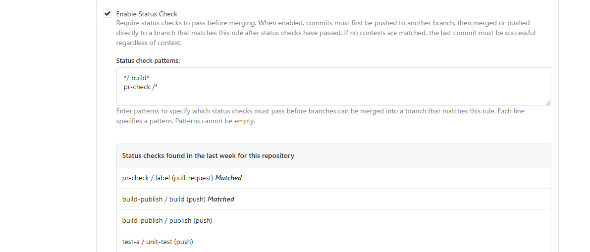
Support for status check pattern ( #24633 )
...
This PR is to allow users to specify status checks by patterns. Users
can enter patterns in the "Status Check Pattern" `textarea` to match
status checks and each line specifies a pattern. If "Status Check" is
enabled, patterns cannot be empty and user must enter at least one
pattern.
Users will no longer be able to choose status checks from the table. But
a __*`Matched`*__ mark will be added to the matched checks to help users
enter patterns.
Benefits:
- Even if no status checks have been completed, users can specify
necessary status checks in advance.
- More flexible. Users can specify a series of status checks by one
pattern.
Before:

After:
---------
Co-authored-by: silverwind <me@silverwind.io>
2023-05-17 16:11:13 +08:00
silverwind
b926f96da7
Reorganize CSS files ( #24739 )
...
Reorganize various CSS files for clarity, group together by subdirectory
in `index.css`. This reorders some of the rules, but I don't think it
should introduce any issues because of that.
2023-05-16 00:13:30 -04:00
silverwind
a7e18b9fb7
Rework Oauth login buttons, swap github logo to monocolor ( #24740 )
...
Diff without whitespace:
https://github.com/go-gitea/gitea/pull/24740/files?diff=unified&w=1
- Use SVGs for GitHub and GitLab oauth providers
- Replace section wrapping with a divider
- Rework icon rendering, increase size from 32px to 40px
Before:
<img width="853" alt="Screenshot 2023-05-15 at 21 54 23"
src="https://github.com/go-gitea/gitea/assets/115237/6ab5cfb4-46ff-469a-bd1f-06780d4a6a0b ">
After (more providers):
<img width="849" alt="Screenshot 2023-05-15 at 21 51 21"
src="https://github.com/go-gitea/gitea/assets/115237/fa84f92f-98e0-4aed-9357-5d62ddd98195 ">
<img width="856" alt="Screenshot 2023-05-15 at 21 56 45"
src="https://github.com/go-gitea/gitea/assets/115237/d3edd7ed-dadd-4302-aca7-08f20adc220e ">
Ref: https://codeberg.org/Codeberg/Community/issues/1023
---------
Co-authored-by: Giteabot <teabot@gitea.io>
2023-05-15 22:46:51 +00:00
silverwind
b92c142c97
Clean up various avatar dimensions ( #24701 )
...
Clean up a few cases where avatar dimensions were overwritten via CSS,
which were no longer needed or were possible to set via HTML width.
Also included are two small fixes:
- Fix one more case of incorrect avatar offset on review timeline
- Vertically center avatars in review sidebar
There is more to be done here, but some of the work depends on Fomantic
`comment` module removal, or in the case of org member lists, a refactor
of the `avatarlink` template to accept a size.
<img width="371" alt="image"
src="https://github.com/go-gitea/gitea/assets/115237/9c5902fb-2b89-4a7d-a152-60e74c3b2c56 ">
<img width="306" alt="image"
src="https://github.com/go-gitea/gitea/assets/115237/c8d92e2a-91c9-4f4a-a7de-6ae1a6bc0479 ">
---------
Co-authored-by: Giteabot <teabot@gitea.io>
2023-05-14 14:15:59 +00:00
silverwind
11552a779f
Remove Fomantic comment module ( #24703 )
...
Remove the comment module and put the styles that we still need into a
separate file, eliminating about 2/3 of the CSS in line count.
2023-05-14 04:21:24 +00:00
wxiaoguang
8a8b753647
Improve button-ghost, remove tertiary button ( #24692 )
...
<img width="474" alt="image"
src="https://github.com/go-gitea/gitea/assets/2114189/7fd231f9-71c3-4769-ba96-37a5b77cf224 ">
<img width="557" alt="image"
src="https://github.com/go-gitea/gitea/assets/2114189/c9945f61-39b4-4711-aea8-c34ef1d714c5 ">
<img width="641" alt="image"
src="https://github.com/go-gitea/gitea/assets/2114189/691be76e-74fd-420d-9b9e-ba1f3b08e0b4 ">
And a page to test buttons:
<details>
<img width="451" alt="image"
src="https://github.com/go-gitea/gitea/assets/2114189/5f61da24-2f36-40ad-a9bb-2205da5f5f04 ">
</details>
---------
Co-authored-by: Giteabot <teabot@gitea.io>
Co-authored-by: silverwind <me@silverwind.io>
2023-05-13 20:38:22 +00:00
wxiaoguang
82224c54e0
Improve avatar uploading / resizing / compressing, remove Fomantic card module ( #24653 )
...
Fixes : #8972
Fixes : #24263
And I think it also (partially) fix #24263 (no need to convert) ,
because users could upload any supported image format if it isn't larger
than AVATAR_MAX_ORIGIN_SIZE
The main idea:
* if the uploaded file size is not larger than AVATAR_MAX_ORIGIN_SIZE,
use the origin
* if the resized size is larger than the origin, use the origin
Screenshots:
JPG:
<details>

</details>
APNG:
<details>


</details>
WebP (animated)
<details>

</details>
The only exception: if a WebP image is larger than MaxOriginSize and it
is animated, then current `webp` package can't decode it, so only in
this case it isn't supported. IMO no need to support such case: why a
user would upload a 1MB animated webp as avatar? crazy .....
---------
Co-authored-by: silverwind <me@silverwind.io>
2023-05-13 20:59:11 +02:00
wxiaoguang
ec8ea58dbe
Rename ".button-link" to ".button-ghost" ( #24670 )
...
Mainstream frameworks:

* https://getbootstrap.com/docs/5.0/components/buttons/
* https://primer.style/css/components/buttons#link-button
* https://nextui.org/docs/components/button#light
* https://coreui.io/react/docs/components/button/
* https://design-system.hpe.design/components/button
* https://chakra-ui.com/docs/components/button/usage#button-variants
* https://mui.com/material-ui/react-button/

All (at least most?) of them make "link" button have "underline" when
hovering.

So, a "link" is a "link", when it's hovered, it should have the
underline by default. To be strict, Gitea's "button-link" is not
link-style, so it needs a better name.

Actually, for the "plain" button, there are some different approaches:

* Some frameworks just make "default" button as no style (not feasible
in Gitea/Fomantic UI)
* Primer uses "btn-invisible", which is not a proper word
* NextUI uses "light", which is not a proper word, either ...
* CoreUI / ChakraUI uses "ghost", I think this name is acceptable.


Welcome to suggest better name for such button.

Or, we just call it ".button-plain" or ".button-simple", in fact I
prefer such simple and clear name.
2023-05-12 14:58:44 +00:00
yp05327
b5c26fa825
Add markdown preview to Submit Review Textarea ( #24672 )
...
Before:

After:

---------
Co-authored-by: wxiaoguang <wxiaoguang@gmail.com>
Co-authored-by: Giteabot <teabot@gitea.io>
2023-05-12 10:53:41 +00:00
silverwind
a96c73f979
Remove svg.svg class, restore .rss-icon ( #24667 )
...
Fix regression from https://github.com/go-gitea/gitea/pull/24476 where
the `svg.svg` class misaligns SVG icons across the site and streched
buttons unintentionally in vertical height.
Before (button 30.3px):
<img width="157" alt="Screenshot 2023-05-11 at 22 09 42"
src="https://github.com/go-gitea/gitea/assets/115237/0fd137ab-ab52-4cf8-afca-c45776d526d0 ">
After (button 30px):
<img width="160" alt="Screenshot 2023-05-11 at 22 09 59"
src="https://github.com/go-gitea/gitea/assets/115237/4b741f4b-0fd2-4fae-9bee-16a7deb098e8 ">
[vertical-align:
middle](https://developer.mozilla.org/en-US/docs/Web/CSS/vertical-align )
is not suitable to align icons to text because
> Aligns the middle of the element with the baseline plus half the
x-height of the parent.
Example of `vertical-align: middle` from MDN:
<img width="232" alt="Screenshot 2023-05-11 at 22 29 28"
src="https://github.com/go-gitea/gitea/assets/115237/179fb756-85a1-4cab-8219-1a4958f333e2 ">
So I think the
[existing](365bb77a54/web_src/css/svg.css (L3)https://github.com/go-gitea/gitea/assets/115237/0cd6edf5-12c0-4bdb-8771-a900f5ba2d35 ">
Co-authored-by: Giteabot <teabot@gitea.io>
2023-05-12 10:23:53 +00:00
yp05327
4aec1f87a4
Remove highlight in repo list ( #24675 )
...
Before:
After:

private or internal repos have `lock` icon, no need to add highlights to
them.
2023-05-12 10:00:17 +02:00
silverwind
67db6b6976
RSS icon fixes ( #24476 )
...
Fix regression from https://github.com/go-gitea/gitea/pull/24471 where
CSS rules for `.icon.grey` were removed which were in use by the RSS
icons.
Gave them their own class instead, removed a wrapper and also fixed
vertical alignment on them. Additionally, did a few related fixes on the
org header for alignment.
Fixes: https://github.com/go-gitea/gitea/issues/24584
<img width="196" alt="Screenshot 2023-05-01 at 22 39 40"
src="https://user-images.githubusercontent.com/115237/235528228-959e2385-c1d2-4d5c-baec-e3784d459653.png ">
<img width="216" alt="Screenshot 2023-05-01 at 22 44 20"
src="https://user-images.githubusercontent.com/115237/235528231-95cbff86-5672-48eb-b214-8bdcefa1612c.png ">
<img width="120" alt="Screenshot 2023-05-01 at 22 56 36"
src="https://user-images.githubusercontent.com/115237/235529844-b94ab554-3259-4d0c-b040-82aed7d1a111.png ">
<img width="372" alt="Screenshot 2023-05-01 at 22 54 25"
src="https://user-images.githubusercontent.com/115237/235529744-1a9c201b-5692-4122-9765-2f201a322a9e.png ">
<img width="477" alt="Screenshot 2023-05-01 at 22 55 28"
src="https://user-images.githubusercontent.com/115237/235529748-62188554-9927-42ef-bc94-7052bce266e2.png ">
---------
Co-authored-by: wxiaoguang <wxiaoguang@gmail.com>
2023-05-10 22:27:02 +00:00
silverwind
f7ede92f82
Notification list enhancements, fix striped tables on dark theme ( #24639 )
...
- Make code block rendering via backticks work
- Remove link color unless hovered
- Remove table stripes and fix stripes rendering on dark theme for other
tables
- Introduce new `button-link` class discussed previously for buttons
that look and act like links and apply it to the two right-side buttons
- Reduce box padding by 8px on each side
- Fix "Mark all read" button margin-right
- brighten `--color-markup-code-block` on arc-green
### Before
<img width="1216" alt="Screenshot 2023-05-10 at 20 00 30"
src="https://github.com/go-gitea/gitea/assets/115237/66da9ec2-dd09-4ef0-8f1d-1822a18b6b43 ">
<img width="1211" alt="Screenshot 2023-05-10 at 20 00 48"
src="https://github.com/go-gitea/gitea/assets/115237/f48e30a2-9a00-4723-93aa-79b97ca0ba0c ">
### After
<img width="1222" alt="Screenshot 2023-05-10 at 20 09 59"
src="https://github.com/go-gitea/gitea/assets/115237/c956e0d0-b3d9-42a4-a3ed-f0431c22bf3f ">
<img width="1218" alt="Screenshot 2023-05-10 at 20 05 34"
src="https://github.com/go-gitea/gitea/assets/115237/f72c1628-3961-4c28-9263-07cdf7531316 ">
2023-05-10 21:59:58 +00:00
silverwind
ae0fa64ef6
Review fixes and enhancements ( #24526 )
...
- Fix regression with icons wrapping from
https://github.com/go-gitea/gitea/pull/24459
- Fix box misalignment on small screen
- Fix avatar misalignment on review comment
- Fix incorrect underline hover effect on review icons
- Move status icon to left side in review box
- Enhance review icon colors, add helper function for it
- Add missing inline avatars in review comments
- Tweak icon sizes because some octicons have inconsistent sizing
### Before
<img width="655" alt="Screenshot 2023-05-04 at 20 50 28"
src="https://user-images.githubusercontent.com/115237/236301230-92325507-6e03-47ac-bfb4-c9ddde310571.png ">
<img width="260" alt="Screenshot 2023-05-04 at 20 50 42"
src="https://user-images.githubusercontent.com/115237/236301236-0dfa50e7-b8fc-4179-ae68-d872bc90f1f3.png ">
### After
<img width="498" alt="Screenshot 2023-05-04 at 20 55 08"
src="https://user-images.githubusercontent.com/115237/236301810-23862c2c-c0a9-43a4-a3eb-ee611c14a7f4.png ">
<img width="219" alt="Screenshot 2023-05-04 at 20 55 16"
src="https://user-images.githubusercontent.com/115237/236301817-d0de02ea-6ab5-43e1-9183-6b3848b72995.png ">
---------
Co-authored-by: Giteabot <teabot@gitea.io>
2023-05-10 09:16:44 +00:00
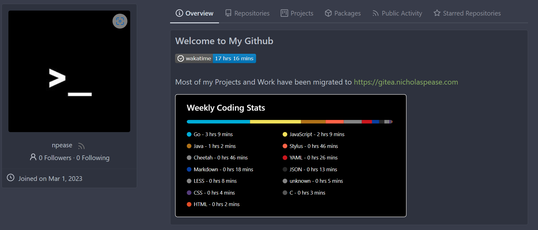
Nicholas Pease
c090f87a8d
Add Gitea Profile Readmes ( #23260 )
...
Implements displaying a README.md file present in a users ```.profile```
repository on the users profile page. If no such repository/file is
present, the user's profile page remains unchanged.
Example of user with ```.profile/README.md```

Example of user without ```.profile/README.md```

This pull request closes the feature request in #12233
Special thanks to @techknowlogick for the help in the Gitea discord!
---------
Co-authored-by: techknowlogick <techknowlogick@gitea.io>
Co-authored-by: Yarden Shoham <hrsi88@gmail.com>
Co-authored-by: Lunny Xiao <xiaolunwen@gmail.com>
Co-authored-by: yp05327 <576951401@qq.com>
Co-authored-by: Yarden Shoham <git@yardenshoham.com>
2023-05-09 05:57:24 +00:00
yp05327
2ee72d011f
Add permission check for moving issue action in project view page ( #24589 )
...
Fix #22954
Only users who have write permission can move issues in the project view page.
2023-05-09 00:50:16 -04:00
silverwind
4a722c9a45
Make Issue/PR/projects more compact, misc CSS tweaks ( #24459 )
...
- Remove various horizontal dividers on repo pages that didn't provide
visual benefit
- Remove label/milestone pills on single issue/pr page
- Remove issue-related pill buttons on projects page
- Increase contrast of color-secondary on arc-green
- Improve notifications icon, make circle bigger
- Remove some inline styles
- Fix focus in issue/pr title edit and select all text on button click
### Issue and PR before and after
<img width="1249" alt="Screenshot 2023-05-01 at 11 44 22"
src="https://user-images.githubusercontent.com/115237/235436662-a708288e-84fb-4b2e-a5a2-3a1c17d28f6c.png ">
<img width="1248" alt="Screenshot 2023-05-01 at 11 58 51"
src="https://user-images.githubusercontent.com/115237/235437992-f863e483-f3cc-4cc1-8204-fd223647a0c9.png ">
### Projects before and after
<img width="1255" alt="Screenshot 2023-05-01 at 11 41 02"
src="https://user-images.githubusercontent.com/115237/235436433-0deb85d6-4e7d-4e74-847f-254cc70a0cf9.png ">
<img width="1267" alt="Screenshot 2023-05-01 at 11 40 03"
src="https://user-images.githubusercontent.com/115237/235436431-715b13cb-f78c-4d86-b27a-9229f9738c5b.png ">
### Releases before and after
<img width="1243" alt="Screenshot 2023-05-01 at 11 41 12"
src="https://user-images.githubusercontent.com/115237/235436457-b655ee6f-03b8-4595-8d8c-b15ea469e988.png ">
<img width="1240" alt="Screenshot 2023-05-01 at 11 40 10"
src="https://user-images.githubusercontent.com/115237/235436456-05a2a0dd-7cbb-4f26-b0d3-4f667df4bb95.png ">
### Misc
<img width="58" alt="Screenshot 2023-05-01 at 10 49 13"
src="https://user-images.githubusercontent.com/115237/235432494-936ce995-6e22-47bc-ab2d-c9e93d31987d.png ">
<img width="57" alt="Screenshot 2023-05-01 at 18 57 08"
src="https://user-images.githubusercontent.com/115237/235492430-1d32cfe0-0f2c-467c-b2fa-925b27e30e0e.png ">
Issue title edit and wrap:
<img width="1238" alt="Screenshot 2023-05-01 at 12 34 40"
src="https://user-images.githubusercontent.com/115237/235441407-d5067a57-e586-4865-a652-282e5944abb4.png ">
<img width="1232" alt="Screenshot 2023-05-01 at 12 06 24"
src="https://user-images.githubusercontent.com/115237/235438710-1a543dda-220f-4d87-8f93-f1710c0695f0.png ">
---------
Co-authored-by: wxiaoguang <wxiaoguang@gmail.com>
2023-05-03 17:58:59 -04:00
wxiaoguang
48e3e38ee0
Clean up polluted styles and remove dead CSS code ( #24497 )
...
Follow #24393
The funny history:
* At the beginning, `.ui.message` was polluted by `text-align: center`
* Then people do `<div class="ui ... message text left">`
* But `.ui.left` is polluted by `float: left`
* Then people do `#xxx .ui.message { width: 100% !important;}`
The code just becomes more and more hacky.
After removing the pollution, everything becomes clear and straight.
And, this PR also does:
1. Remove the `package.css`, its styles could be provided by `top
aligned`
2. Remove `#avatar-arrow`, dead code
Screenshot:


Co-authored-by: Giteabot <teabot@gitea.io>
2023-05-03 14:32:10 -04:00
silverwind
3ae997614a
Enhance stylelint rule config, remove dead CSS ( #24472 )
...
Make this stylelint rule match on more properties.
The dead CSS relates to the navbar, which currently has classes:
```
ui top secondary stackable main menu following bar light
```
Which means `.following.bar .top.menu` can never match, so remove this
dead CSS as well as inactive `z-index` and `left` on it.
Commits table striping becomes more visible on dark theme, but I don't
think it's worth introducing a new color until
https://github.com/go-gitea/gitea/pull/24423 is ready, which would have
to remove it again:
<img width="668" alt="Screenshot 2023-05-01 at 18 41 49"
src="https://user-images.githubusercontent.com/115237/235489873-6b272899-1d78-443a-872c-ee7731c269f9.png ">
<img width="680" alt="Screenshot 2023-05-01 at 18 41 41"
src="https://user-images.githubusercontent.com/115237/235489878-1b9468af-c74f-48a6-a469-9eba57cfcb4d.png ">
2023-05-02 23:15:52 -04:00
silverwind
fa506cd571
Remove font-awesome and fomantic icon module ( #24471 )
...
Fixes https://github.com/go-gitea/gitea/issues/10410 .
This PR removes around 120kB of CSS.
2023-05-01 13:25:54 -04:00
wxiaoguang
3e7101dd64
Improve "new-menu" ( #24465 )
...
I am not sure what "new-menu" means, but I think we need to fix these
problems:

1. it shouldn't have "stackable", which makes the items stacked when
width is small. the `new-menu` already has `overflow: auto`
2. `justify-content: center` doesn't work with `overflow: auto` (for
small width), so use `margin: auto`
*
https://bhch.github.io/posts/2021/04/centring-flex-items-and-allowing-overflow-scroll/
3. `runner-new-menu` is dead code (copying & pasting ?)
2023-05-01 12:08:37 -04:00
silverwind
5adf32b48e
Remove fomantic breadcrumb module ( #24463 )
...
### File path before/after
<img width="522" alt="Screenshot 2023-05-01 at 13 23 33"
src="https://user-images.githubusercontent.com/115237/235445636-57776038-c98e-4cab-8abe-045138a76958.png ">
<img width="522" alt="Screenshot 2023-05-01 at 13 24 08"
src="https://user-images.githubusercontent.com/115237/235445638-70bef62a-1b70-41f8-ba51-728db4d54402.png ">
### File edit before/after
<img width="499" alt="Screenshot 2023-05-01 at 13 24 46"
src="https://user-images.githubusercontent.com/115237/235445676-7b3cc23e-289b-40a6-8d4f-0d7fb2efb55e.png ">
<img width="497" alt="Screenshot 2023-05-01 at 13 24 52"
src="https://user-images.githubusercontent.com/115237/235445677-db9f3974-8456-46de-a32b-9198110c0540.png ">
### Cherry-pick before/after
<img width="590" alt="Screenshot 2023-05-01 at 13 25 30"
src="https://user-images.githubusercontent.com/115237/235445717-99445024-1bb2-46d4-9bd8-8086bad57d34.png ">
<img width="582" alt="Screenshot 2023-05-01 at 13 25 37"
src="https://user-images.githubusercontent.com/115237/235445720-9c1dc497-eb23-4e10-a727-27f4d6df69e6.png ">
2023-05-01 11:40:02 -04:00
wxiaoguang
ce16ff6219
Remove unnecessary g-menu-stackable-scrollable ( #24462 )
...
Fix #24460

That's a mistake but ..... no idea why I wrote so ... remove it.
2023-05-01 12:51:14 +02:00
silverwind
1bd2772235
Replace remaining fontawesome dropdown icons with SVG ( #24455 )
...
- Replace leftover dropdown triangles with SVG
- Replace remove icon with SVG and add styling for it:
<img width="817" alt="Screenshot 2023-05-01 at 00 40 05"
src="https://user-images.githubusercontent.com/115237/235379271-4674d4f7-b11e-4d6d-90f9-1478325443ca.png ">
<img width="816" alt="Screenshot 2023-05-01 at 00 46 56"
src="https://user-images.githubusercontent.com/115237/235379451-b515afb3-9773-4f6f-a259-e7048235bcba.png ">
2023-05-01 05:35:02 -04:00
silverwind
6981885303
Add ui-monospace and SF Mono to --fonts-monospace ( #24442 )
...
- Add `ui-monospace` to support Safari 13.4+.
- Add `SF Mono` variant to support the font on non-mac.
- Quote fonts as per [W3C
recommendation](https://www.w3.org/TR/2018/REC-css-fonts-3-20180920/#propdef-font-family ).
> it is recommended to quote font family names that contain white space,
digits, or punctuation characters other than hyphens
Fixes: https://github.com/go-gitea/gitea/issues/22125
2023-04-30 14:58:32 -04:00
silverwind
f7cf7e6848
Fix config list overflow and layout ( #24312 )
...
Fixes: https://github.com/go-gitea/gitea/issues/24299
<img width="531" alt="Screenshot 2023-04-24 at 21 05 40"
src="https://user-images.githubusercontent.com/115237/234091905-9db42697-87b3-40a0-bd18-9e910ad8a2ae.png ">
2023-04-30 13:32:07 -04:00
wxiaoguang
14c142b0bc
Improve issue list filter ( #24425 )
...
Partial regression of #24393 , not only regression, but broken for long
time, 24393 didn't really improve it but used wrong `overflow: scroll`.
Actually, that "ui secondary filter menu labels" shouldn't be set as
scrollable (I missed that at that time), the problem is: if a "ui menu"
has "dropdown" items, then it should not be scrollable. Otherwise the
dropdown menu can't be shown correctly.
And there are more problems:
* The "issue-filters" shouldn't be used anywhere else (copying&pasting
problem again ....)
* There is also an "issue-actions" container, it should also be fixed.
* There are similar problems on the milestone page.
* The old comment in code: "grid column" doesn't work well.
The major changes of this PR are: use "flex: 1" instead of "ui grid
column".
After this PR, not 100% perfect but much better than before.
2023-04-30 11:51:20 -04:00
sillyguodong
e8173c2c33
Move Rename branch from repo settings page to the page of branches list ( #24380 )
...
Co-Author: @wxiaoguang

It is more convenient that user just need to enter a new branch name after he selects the branch which he want to rename.
So this PR move the function of renaming branch to the page of branches list.

This PR also restyle the button of `new branch`, `download`, `delete`....

https://user-images.githubusercontent.com/33891828/235277997-413060bb-759f-430a-b5c4-df5e40ffcd28.mov

---------

Co-authored-by: wxiaoguang <wxiaoguang@gmail.com>
2023-04-30 23:08:51 +08:00
silverwind
8f4dafcd4e
Rework header bar on issue, pull requests and milestone ( #24420 )
...
- Make search bar dynamic full width via flexbox
- Make all buttons `small` so font size is the same for all elements in
the header
- Remove primary color from search field, add SVG icon like on Code tab
- Fix button vertical padding being enlarged by SVG icons
[View diff without
whitespace](https://github.com/go-gitea/gitea/pull/24420/files?diff=unified&w=1 )
<img width="1226" alt="Screenshot 2023-04-29 at 11 58 53"
src="https://user-images.githubusercontent.com/115237/235296851-74848267-664f-4c1f-b94c-a1b94196ff75.png ">
<img width="1219" alt="Screenshot 2023-04-29 at 11 59 39"
src="https://user-images.githubusercontent.com/115237/235296852-bcfde5ed-8658-43c2-b7e5-3ad84611e76f.png ">
Mobile:
<img width="437" alt="Screenshot 2023-04-29 at 11 59 52"
src="https://user-images.githubusercontent.com/115237/235296860-99263373-7b27-4540-868c-a93e70f281ca.png ">
<img width="433" alt="Screenshot 2023-04-29 at 12 00 00"
src="https://user-images.githubusercontent.com/115237/235296862-6cf64317-a864-405a-a00f-b5ab620349f5.png ">
2023-04-29 23:33:25 -04:00
wxiaoguang
5a5ab8ef5a
Start cleaning the messy ".ui.left / .ui.right", improve label list page, fix stackable menu ( #24393 )
...
Since 2015/2016, there is a global pollution: ".ui.left" / ".ui.right".
Fomantic UI doesn't work this way, it just conflicts with many Fomantic
definitions.
This PR starts the cleaning work of such techinical debts.
And, the "label list" page has been quite messy for long time, for
example, why "li" appears in "div" ......
And fix #24296
<details>


</details>
2023-04-29 07:35:59 -04:00
Hester Gong
72e956b79a
Improve protected branch setting page ( #24379 )
...
Main changes:
1. Change html structure of protected branch page, use [`grouped
fields`](https://fomantic-ui.com/collections/form.html#grouped-fields )
instead of `fields` for better margin, and wrap `grouped fields` around
related `field`s, remove unnecessary `<div id="protection_box"
class="fields">` outer div
2. Changed some order of field to make them more categorized, used `ui
dividing header` for categorization and fine tune css.
Before:
<img width="1907" alt="Screen Shot 2023-04-27 at 14 56 19"
src="https://user-images.githubusercontent.com/17645053/234783731-bce8a7ce-dfc9-4d47-a3a8-b962ebea9467.png ">
<img width="1849" alt="Screen Shot 2023-04-27 at 14 56 30"
src="https://user-images.githubusercontent.com/17645053/234783740-c47d314e-5e2d-4854-98fd-c88f85ef3584.png ">
<img width="1872" alt="Screen Shot 2023-04-27 at 14 56 36"
src="https://user-images.githubusercontent.com/17645053/234783745-18e35a75-07e8-451d-b001-f9bcf16fcab5.png ">
After:
https://user-images.githubusercontent.com/17645053/235114568-da010aad-7654-4410-ab8c-5d0fce7edadb.mov
3. Changed "Enable Merge Whitelist" to radio checkbox, and added "Enable
Merge" radio checkbox, which are exclusive
Before:
<img width="926" alt="Screen Shot 2023-04-28 at 13 08 29"
src="https://user-images.githubusercontent.com/17645053/235059233-75790f7a-e5ea-4e1c-82c6-509fef8b84b3.png ">
After:
<img width="942" alt="Screen Shot 2023-04-28 at 13 09 28"
src="https://user-images.githubusercontent.com/17645053/235059367-852d1f61-8407-4126-8c79-315b9c1ffada.png ">
4. Add a link to set default branch on branch list page (with reference
to github)
https://user-images.githubusercontent.com/17645053/234787404-61c1c7b6-aabf-429f-a109-5b690e4e0b5a.mov
5. Removed dead codes.
---------
Co-authored-by: wxiaoguang <wxiaoguang@gmail.com>
Co-authored-by: silverwind <me@silverwind.io>
Co-authored-by: Giteabot <teabot@gitea.io>
2023-04-29 06:44:52 -04:00
wxiaoguang
83022013c8
Fix layouts of admin table / adapt repo / email test ( #24370 )
...
Ref:
https://github.com/go-gitea/gitea/pull/24315#pullrequestreview-1403034993
And fix the incorrect layout for "dasbboard", the "form" shouldn't
follow `<h4 class="ui top attached header">`, so move it to inner.
Diff with ignoring spaces:
https://github.com/go-gitea/gitea/pull/24370/files?diff=unified&w=1
A known bug: the adapt/delete button doesn't work due to a historical
messy logic, will fix it in next PR (#24374 )


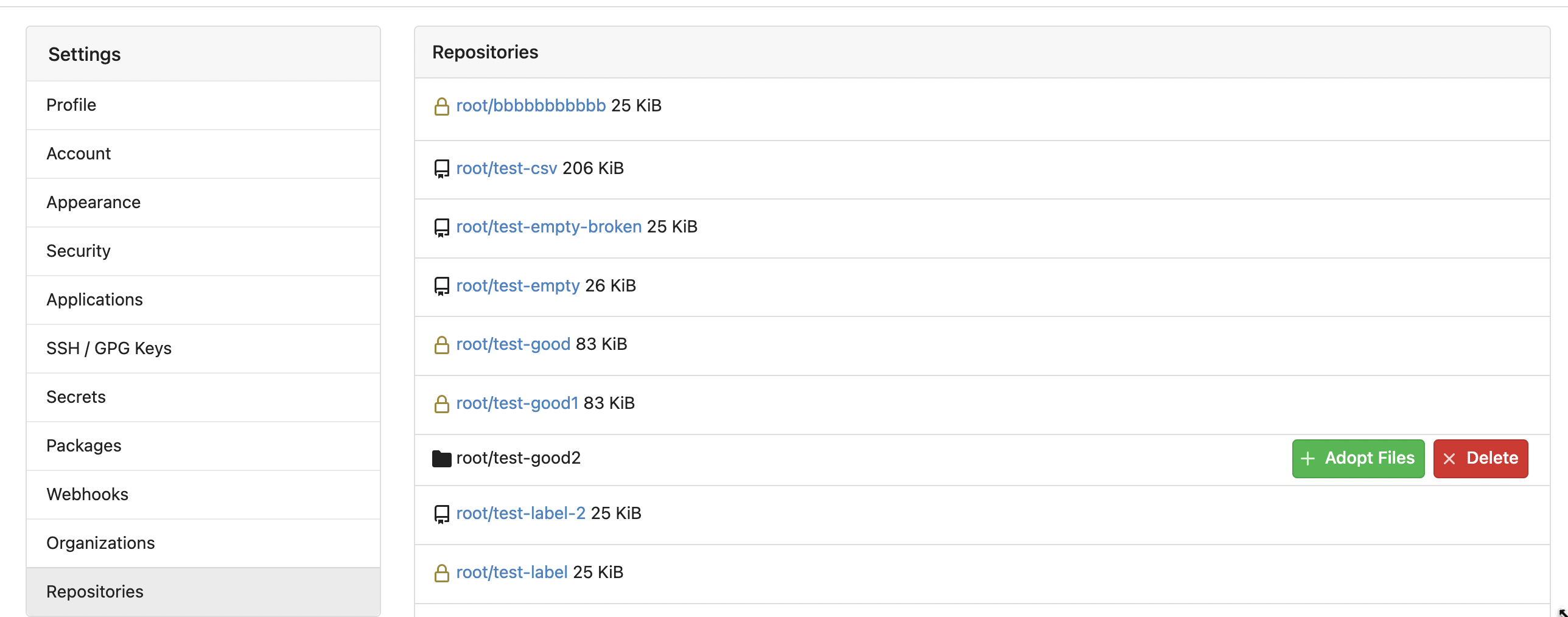
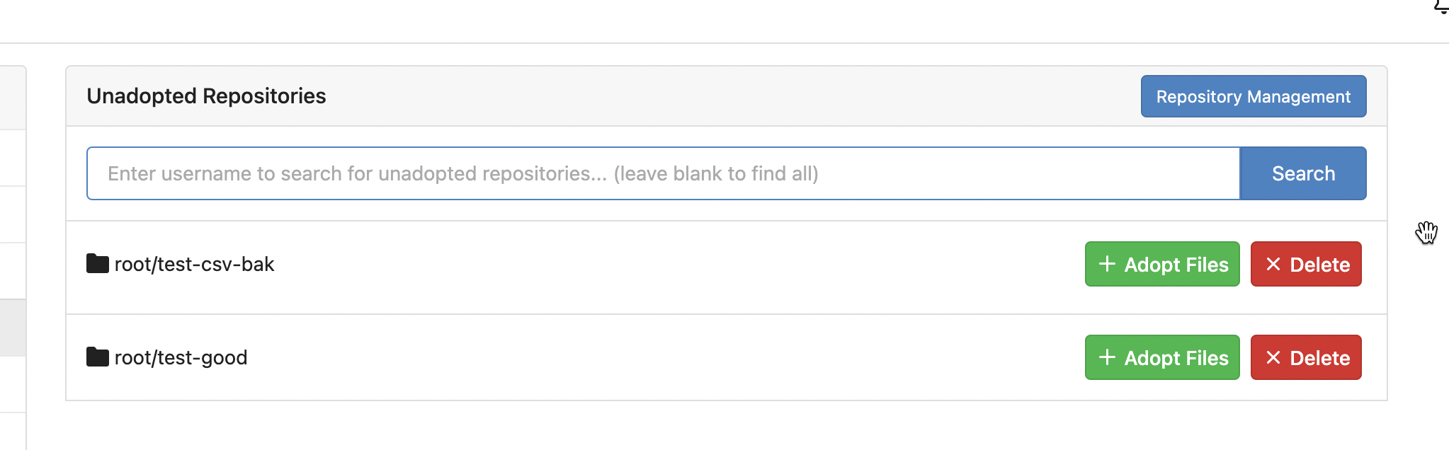
2023-04-28 09:48:41 +08:00
Hester Gong
63a401ac40
Move secrets and runners settings to actions settings ( #24200 )
...
This PR moves the secrets and runners settings to actions settings on
all settings(repo,org,user,admin) levels.
After this PR, if
[ENABLED](5e7543fcf4/custom/conf/app.example.ini (L2604)https://user-images.githubusercontent.com/17645053/234489731-15822d21-38e1-4560-8bbe-69f122376abc.png ">
2. User Level
"Secrets Management"
<img width="1427" alt="Screen Shot 2023-04-26 at 14 34 30"
src="https://user-images.githubusercontent.com/17645053/234489795-68c9c0cb-24f8-4f09-95c6-458ab914c313.png ">
3. Repo and Organization Levels
"Runners Management" and "Secrets Management"
Org:
<img width="1437" alt="Screen Shot 2023-04-26 at 14 35 07"
src="https://user-images.githubusercontent.com/17645053/234489996-f3af5ebb-d354-46ca-9087-a0b586845281.png ">
<img width="1433" alt="Screen Shot 2023-04-26 at 14 35 14"
src="https://user-images.githubusercontent.com/17645053/234490004-3abf8fed-81fd-4ce2-837a-935dade1793d.png ">
Repo:
<img width="1419" alt="Screen Shot 2023-04-26 at 14 34 50"
src="https://user-images.githubusercontent.com/17645053/234489904-80c11038-4b58-462c-9d0b-8b7cf70bc2b3.png ">
<img width="1430" alt="Screen Shot 2023-04-26 at 14 34 57"
src="https://user-images.githubusercontent.com/17645053/234489918-4e8d1fe2-9bcd-4d8a-96c1-238a8088d92e.png ">
It also finished these tasks :
- [x] rename routers function "runners" to "actions", and refactor
related file names
- [x] check and modify part of the runners related functions to match
their name
- [x] Fix backend check caused by fmt check
---------
Co-authored-by: wxiaoguang <wxiaoguang@gmail.com>
2023-04-27 20:08:47 -04:00
Hester Gong
f1a4330306
Modify width of ui container, fine tune css for settings pages and org header ( #24315 )
...
Close #24302
Part of #24229 , Follows #24246
This PR focused on CSS style fine-tune, main changes:
1. Give `.ui.ui.ui.container` a width of `1280px` with a max-width of
`calc(100vw - 64px)`, so the main contents looks better on large
devices.
2. Share styles for table elements in all levels settings pages to fix
overflow of runners table on mobile and for consistency (The headers on
mobile can be further improved, but haven't found a proper way yet).
3. Use [stackable
grid](https://fomantic-ui.com/collections/grid.html#stackable ) and
[device column width](https://fomantic-ui.com/examples/responsive.html )
for responsiveness for some pages (repo/org collaborators settings
pages, org teams related page)
4. Fixed #24302 by sharing label related CSS in reporg.css
5. Fine tune repo tags settings page
---------
Co-authored-by: wxiaoguang <wxiaoguang@gmail.com>
2023-04-26 11:59:08 -04:00
silverwind
4d5c803f8b
Fix Monaco IOS keyboard button ( #24341 )
...
Fix https://github.com/go-gitea/gitea/issues/16188 . Turns out the
element was completely misaligned by fomantic styles. Add most of the
original styles in `!important` form to fix.
Tapping the button doesn't do anything useful in Simulator.app, but I
guess it's still better to not outright hide it in case it has a
possiblity to work.
<img width="121" alt="image"
src="https://user-images.githubusercontent.com/115237/234379685-4e67f8cd-7e91-4bcc-8e17-9d5b2ebed6cd.png ">
Co-authored-by: Giteabot <teabot@gitea.io>
2023-04-26 01:31:50 -04:00
silverwind
75e35fb03a
Fix runner button height ( #24338 )
...
Fixes https://github.com/go-gitea/gitea/issues/24326 .
Set size class and downsize any such buttons that have a dropdown icon
because the dropdown icon increases button height artificially.
[`:has()`](https://developer.mozilla.org/en-US/docs/Web/CSS/:has ) is not
supported in Firefox yet, but works fine with the experimental pref
enabled. I see this as a graceful degradation in unsupporting browsers.
2023-04-26 00:09:29 -04:00
wxiaoguang
0e8045d8ea
Fix template function DateTime ( #24317 )
...
Before, 500 error

2023-04-25 15:48:30 -04:00