silverwind
3ccda41a53
Introduce .secondary-nav and handle .page-content spacing universally ( #29982 )
...
Fixes: https://github.com/go-gitea/gitea/issues/29981 . Introduce
`.secondary-nav` as a universal way for styling and margin adjustments
inside `.page-content`.
If the first child of `.page-content` is `.secondary-nav`, we add margin
below it, otherwise we add padding to the first child. Notable changes:
- `--color-header-wrapper` is replaced with `--color-secondary-nav-bg`.
- `navbar` class is removed.
---------
Co-authored-by: Giteabot <teabot@gitea.io>
Co-authored-by: wxiaoguang <wxiaoguang@gmail.com>
2024-03-22 23:54:09 +00:00
silverwind
97b078d226
Add background to dashboard navbar, fix missing padding ( #29940 )
...
Two small CSS fixes:
1. Add background and reduced padding/avatar size to dashboard navbar.
We use that background already in a number of "secondary navbars", so it
fits.
<img width="1344" alt="Screenshot 2024-03-20 at 18 18 21"
src="https://github.com/go-gitea/gitea/assets/115237/ce5ebedc-e607-42c7-b7b4-b7a4c0ee68f2 ">
2. Fix padding on top of user settings and subscriptions, regressed by
https://github.com/go-gitea/gitea/pull/29922 .
2024-03-20 18:33:00 +00:00
silverwind
8cad44f410
Remove the negative margin from .page-content ( #29922 )
...
The negative margin was suboptimal and presents a few unnecessary
challenges while styling the page. Remove it and add custom margin
values, which slightly changes the height a few things near the top of
the page as well:
15px less height of explore and login navbar:
<img width="899" alt="Screenshot 2024-03-20 at 00 52 34"
src="https://github.com/go-gitea/gitea/assets/115237/72a01ca4-5d17-4a0f-b915-61f95054fcb1 ">
15px reduced padding-top height of "user bar" and equal 4px padding
added:
<img width="484" alt="Screenshot 2024-03-20 at 00 52 50"
src="https://github.com/go-gitea/gitea/assets/115237/a8507e6d-372d-4a8b-9048-66fcf8a5facd ">
3px less padding on top of repo:
<img width="552" alt="Screenshot 2024-03-20 at 00 53 49"
src="https://github.com/go-gitea/gitea/assets/115237/dede6e44-7688-440f-a1b6-13532638ae03 ">
2024-03-20 11:21:18 +00:00
puni9869
0989f437df
Dashboard context dropdown position fix on landing page in mobile view. ( #27047 )
...
as title.
Screensots
before

after

2023-09-13 15:15:36 +08:00
silverwind
9b76df53dc
Minor dashboard tweaks, fix flex-list margins ( #26829 )
...
Some small dashboard tweaks:
- Remove margin-bottom from divider so first item does not appear to
have un-equal margins
- Restore previous icon color
- Add slight margin-right to icon
Before:
<img width="783" alt="Screenshot 2023-08-31 at 00 10 28"
src="https://github.com/go-gitea/gitea/assets/115237/b75f70d7-8704-4afb-866d-fea0484c52d4 ">
After:
<img width="783" alt="Screenshot 2023-08-31 at 00 10 08"
src="https://github.com/go-gitea/gitea/assets/115237/50ed0c47-6f7c-449e-a054-13091369d43f ">
---------
Co-authored-by: wxiaoguang <wxiaoguang@gmail.com>
2023-08-31 21:28:45 +00:00
delvh
dca2f9371d
Unify border-radius behavior ( #26770 )
...
## Changes
- no more hardcoded `border-radius`es (apart from `0`)
- no more value inconsistencies
- no more guessing what pixel value you should use
- two new variables:
- `--border-radius-medium` (for elements where the normal border radius
does not suffice)
  - `--border-radius-circle` (for displaying circles)

---------

Co-authored-by: silverwind <me@silverwind.io>
2023-08-28 19:43:59 +00:00
wxiaoguang
e4b2bdfbc0
More improvements for the "flex list" and the dashboard list ( #26675 )
...
Follow #26649 and #25790 and add one more example (text truncate) in the devtest page
2023-08-23 04:23:30 +00:00
Denys Konovalov
b9baed2c74
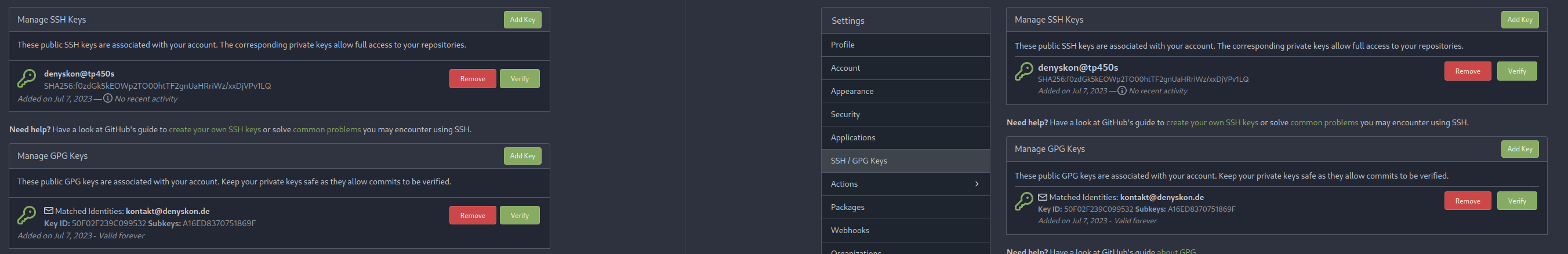
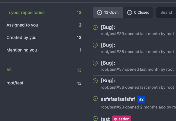
Introduce flex-list & flex-item elements for Gitea UI ( #25790 )
...
This PR introduces a new UI element type for Gitea called `flex-item`.
It consists of a horizontal card with a leading, main and trailing part:

The idea behind it is that in Gitea UI, we have many cases where we use
this kind of layout, but it is achieved in many different ways:
- grid layout
- `.ui.list` with additional hacky flexbox
- `.ui.key.list` - looks to me like a style set originally created for
ssh/gpg key list, was used in many other places
- `.issue.list` - created for issue cards, used in many other places
- ...
This new style is based on `.issue.list`, specifically the refactoring
of it done in #25750 .
In this PR, the new element is introduced and lots of templates are
being refactored to use that style. This allows to remove a lot of
page-specific css, makes many of the elements responsive or simply
provides a cleaner/better-looking way to present information.
A devtest section with the new style is also available.
<details>
<summary>Screenshots (left: before, right: after)</summary>


</details>
---------
Co-authored-by: Giteabot <teabot@gitea.io>
2023-08-01 00:13:42 +02:00
silverwind
6a075589bf
Fix mobile navbar and misc cleanups ( #25134 )
...
- Fix and improve mobile navbar layout
- Apply all cleanups suggested in
https://github.com/go-gitea/gitea/pull/25111
- Make media query breakpoints match Fomantic's exactly
- Clean up whitespace in class on navbar items
Mobile navbar before and after:
<img width="745" alt="Screenshot 2023-06-08 at 08 40 56"
src="https://github.com/go-gitea/gitea/assets/115237/ca84b239-b10f-41db-8c06-dcf2b6dd9d28 ">
<img width="739" alt="Screenshot 2023-06-08 at 08 41 23"
src="https://github.com/go-gitea/gitea/assets/115237/09133c54-eb7e-4110-858c-ead23c3b7521 ">
---------
Co-authored-by: wxiaoguang <wxiaoguang@gmail.com>
Co-authored-by: Giteabot <teabot@gitea.io>
2023-06-09 09:10:51 +00:00
wxiaoguang
48bfea6705
Fix incorrect issuel filter menu style ( #25018 )
...
Before:
<details>
</details>
After:
<details>


</details>
2023-05-31 12:44:28 +02:00
silverwind
245f2c08db
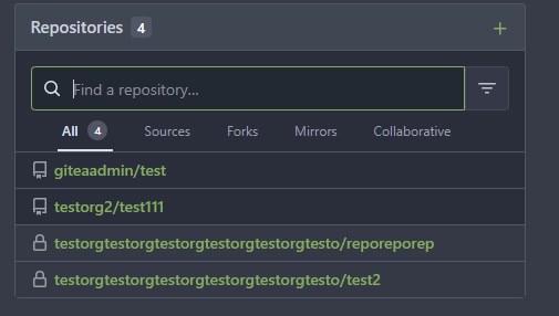
Repo list improvements, fix bold helper classes ( #24935 )
...
- Fix bold helper classes that were broken because of CSS syntax error
- Refined the repo list CSS and layout
- Removing bold
- Downsize the mirror icon to fit
- Fix icon positions
- Adapted the org list to match
- Center the '+' icon and mute it
<img width="385" alt="Screenshot 2023-05-25 at 18 38 31"
src="https://github.com/go-gitea/gitea/assets/115237/ac8d6efb-5751-4845-a4ab-db1ddaf36ec3 ">
<img width="384" alt="Screenshot 2023-05-25 at 18 30 29"
src="https://github.com/go-gitea/gitea/assets/115237/bbd39ae7-da9d-4c6f-bfe3-42f28b7a74c3 ">
2023-05-29 16:55:23 +08:00
yp05327
4aec1f87a4
Remove highlight in repo list ( #24675 )
...
Before:
After:

private or internal repos have `lock` icon, no need to add highlights to
them.
2023-05-12 10:00:17 +02:00
Krzysztof Jeziorny
fcad9fd19f
Vertical widths of containers removed ( #24184 )
...
A vertical overflow appears in Firefox 112/MacOS 12.6 when the system
setting for scrollbars is to "Always" show them.
---
Here, the fixed 100vw container widths are removed, which removes the
overflow. It is, however, only simulated in Developer Tools in latest
Firefox and Chromium, so please test on a Gitea installation.
2023-04-19 12:13:00 -04:00
silverwind
202803fc69
Replace Less with CSS ( #23481 )
...
Ran most of the Less files through the Less compiler and Prettier and
then followed up with a round of manual fixes.

The Less compiler had unfortunately stripped all `//` style comments
that I had to restore (It did preserve `/* */` comments). Other fixes
include duplicate selector removal which were revealed after the
transpilation and which weren't caught by stylelint before but now are.

Fixes: https://github.com/go-gitea/gitea/issues/15565
2023-03-14 22:20:19 -04:00