HEREYUA
0b4ff15356
Solving the issue of UI disruption when the review is deleted without refreshing ( #29951 )
...
**After deleting the review and refreshing, the display is normal.
However, Without refreshing, the interface will be broken**


https://github.com/go-gitea/gitea/assets/37935145/f5cb19a6-eb26-47b0-b8ee-15b575bbe1ac

**after**


https://github.com/go-gitea/gitea/assets/37935145/aa65922c-2ebf-4fce-ad91-35661f70329a
2024-03-21 18:38:27 +08:00
silverwind
1a4f693f9f
Fix JS error and improve error message styles ( #29963 )
...
Fixes: https://github.com/go-gitea/gitea/issues/29956 . This error
exposed a existing bug in the code, it was just never noticed because
the jQuery expression evaluated without error before while the new one
doesn't.
Also improves error message styles:
Before:
<img width="1338" alt="Screenshot 2024-03-21 at 09 16 07"
src="https://github.com/go-gitea/gitea/assets/115237/1cc1ef89-ad94-491e-bbca-75387f7547a0 ">
After:
<img width="1335" alt="Screenshot 2024-03-21 at 09 15 44"
src="https://github.com/go-gitea/gitea/assets/115237/312efc79-5353-4e2a-a703-1bccd3c01736 ">
2024-03-21 10:16:11 +00:00
silverwind
444460ea80
Misc color tweaks ( #29943 )
...
Minor color tweaks:
- Better text contrasts
- Better distinguish nav and header wrapper in light theme
- Input boxes are now white on light theme
- Slightly darker dark theme background
<img width="503" alt="Screenshot 2024-03-20 at 19 31 54"
src="https://github.com/go-gitea/gitea/assets/115237/c7802a84-2386-4332-bd91-f419473ff644 ">
<img width="510" alt="Screenshot 2024-03-20 at 19 32 24"
src="https://github.com/go-gitea/gitea/assets/115237/21d3529e-6e0a-413a-9e9e-a03bea2405eb ">
2024-03-20 23:48:04 +00:00
Lunny Xiao
76ec541051
Fix and rewrite markup anchor processing ( #29931 )
...
Fix #29877

---------

Co-authored-by: silverwind <me@silverwind.io>
2024-03-21 01:02:53 +02:00
silverwind
286268c915
Remove fomantic grid module ( #29894 )
...
Removed the grid module and moved the used parts it into our own CSS,
eliminating around 75% unused CSS in turn.
2024-03-20 22:05:24 +00:00
silverwind
97b078d226
Add background to dashboard navbar, fix missing padding ( #29940 )
...
Two small CSS fixes:
1. Add background and reduced padding/avatar size to dashboard navbar.
We use that background already in a number of "secondary navbars", so it
fits.
<img width="1344" alt="Screenshot 2024-03-20 at 18 18 21"
src="https://github.com/go-gitea/gitea/assets/115237/ce5ebedc-e607-42c7-b7b4-b7a4c0ee68f2 ">
2. Fix padding on top of user settings and subscriptions, regressed by
https://github.com/go-gitea/gitea/pull/29922 .
2024-03-20 18:33:00 +00:00
silverwind
99d7ef5091
Prevent layout shift in <overflow-menu> items ( #29831 )
...
There is a small layout shift in when active tab changes. Notice how the
actions SVG is unstable:

This is because the active item with bold text is wider then the
inactive one. I have applied [this
trick](https://stackoverflow.com/a/32570813/808699 ) to prevent this
layout shift. It's only active inside `<overflow-menu>` because I wanted
to avoid changing HTML and doing it in regular JS would cause a flicker.
I don't expect us to introduce other similar menus without
`<overflow-menu>`, so that place is likely fine.

I also changed the weight from 500 to 600, slightly reduced horizontal
padding, merged some tab-bar related CSS rules and a added a small
margin below repo-header so it does not look so crammed against the
buttons on top.
---------
Co-authored-by: wxiaoguang <wxiaoguang@gmail.com>
2024-03-20 17:00:35 +00:00
silverwind
8cad44f410
Remove the negative margin from .page-content ( #29922 )
...
The negative margin was suboptimal and presents a few unnecessary
challenges while styling the page. Remove it and add custom margin
values, which slightly changes the height a few things near the top of
the page as well:
15px less height of explore and login navbar:
<img width="899" alt="Screenshot 2024-03-20 at 00 52 34"
src="https://github.com/go-gitea/gitea/assets/115237/72a01ca4-5d17-4a0f-b915-61f95054fcb1 ">
15px reduced padding-top height of "user bar" and equal 4px padding
added:
<img width="484" alt="Screenshot 2024-03-20 at 00 52 50"
src="https://github.com/go-gitea/gitea/assets/115237/a8507e6d-372d-4a8b-9048-66fcf8a5facd ">
3px less padding on top of repo:
<img width="552" alt="Screenshot 2024-03-20 at 00 53 49"
src="https://github.com/go-gitea/gitea/assets/115237/dede6e44-7688-440f-a1b6-13532638ae03 ">
2024-03-20 11:21:18 +00:00
Yarden Shoham
adc61c5d71
Remove jQuery .attr from the user search box ( #29919 )
...
- Switched from jQuery `.attr` to plain javascript `.getAttribute`
- Tested the user search box and it works as before

Signed-off-by: Yarden Shoham <git@yardenshoham.com>
2024-03-20 00:09:52 +00:00
Yarden Shoham
dd043854ee
Remove jQuery .attr from the archive download and compare page branch selector ( #29918 )
...
- Switched from jQuery `.attr` to plain javascript `.getAttribute`
- Tested the archive download and compare page branch selector
functionality and it works as before

Signed-off-by: Yarden Shoham <git@yardenshoham.com>
2024-03-20 00:04:24 +00:00
Yarden Shoham
cb98e27992
Remove jQuery .attr from the image diff ( #29917 )
...
- Switched from jQuery `.attr` to plain javascript `.setAttribute`
- Tested the image diff functionality and it works as before

Signed-off-by: Yarden Shoham <git@yardenshoham.com>
2024-03-19 23:49:15 +00:00
Yarden Shoham
4cfda02419
Remove jQuery .attr from the quick pull request button text ( #29916 )
...
- Switched from jQuery `.attr` to plain javascript `.getAttribute`
- Tested the quick pull request button text change functionality and it
works as before

Signed-off-by: Yarden Shoham <git@yardenshoham.com>
2024-03-19 23:44:21 +00:00
Yarden Shoham
55a8f4510a
Remove jQuery .attr from the issue author dropdown ( #29915 )
...
- Switched from jQuery `.attr` to plain javascript `.getAttribute`
- Tested the issue author dropdown functionality and it works as before

Signed-off-by: Yarden Shoham <git@yardenshoham.com>
2024-03-19 23:39:36 +00:00
silverwind
fa100618c4
Forbid jQuery .css and refactor all usage ( #29852 )
...
Tested all functionality. There is a [pre-existing
bug](https://github.com/go-gitea/gitea/issues/29853 ) when moving a
project panels which is not caused by this refactoring.
---------
Co-authored-by: wxiaoguang <wxiaoguang@gmail.com>
2024-03-19 16:28:46 +00:00
silverwind
5a8559ec47
Fix border on focus in dashboard repo search ( #29893 )
...
Before:
<img width="449" alt="Screenshot 2024-03-18 at 22 35 10"
src="https://github.com/go-gitea/gitea/assets/115237/f2893870-e7a3-4e34-b0cf-4610735c9b36 ">
After:
<img width="453" alt="image"
src="https://github.com/go-gitea/gitea/assets/115237/36a9f800-28a4-40fc-b6d2-a2e717ddba01 ">
2024-03-19 10:36:54 +00:00
silverwind
34290a00c4
Migrate border and margin classes to Tailwind ( #29828 )
...
Used all existing css vars, other migrations are 1:1.

---------

Co-authored-by: wxiaoguang <wxiaoguang@gmail.com>
2024-03-18 14:47:05 +00:00
wxiaoguang
b251e608c0
Only do counting when count_only=true for repo dashboard ( #29884 )
...
Ref: #29878
2024-03-18 11:05:17 +00:00
silverwind
33973ac567
Avoid JS error on issue/pr list when logged out ( #29854 )
...
When logged out, the checkboxes are not there on the issue/pr lists,
which would cause an error here.

Fixes: https://github.com/go-gitea/gitea/issues/29862

---------

Co-authored-by: delvh <dev.lh@web.de>
2024-03-17 12:50:32 +00:00
wxiaoguang
673286d8c8
Refactor clone-panel styles ( #29861 )
...
1. The borders were doubled on the "empty" page, fix it.
2. Remove unnecessary CSS classes like "clone", "compact", etc
3. Use CSS class "clone-panel" instead of ID "clone-panel"
4. Use `tw-flex-1` instead of `gt-f1`
5. Remove unnecessary ID "more-btn"
2024-03-17 12:40:42 +00:00
silverwind
4b1c88628a
Load citation JS only when needed ( #29855 )
...
Previously, the citation js would load every time when opening a citable
repo. Now it only loads when the user clicks the button for it. The
loading state is representend with a spinner on the button:
<img width="83" alt="Screenshot 2024-03-17 at 00 25 13"
src="https://github.com/go-gitea/gitea/assets/115237/29649089-13f3-4974-ab81-e12c0f8e651f ">
Diff ist best viewed with whitespace hidden.
---------
Co-authored-by: Giteabot <teabot@gitea.io>
2024-03-17 11:04:59 +01:00
silverwind
c20b56815d
Fix semantic.json ( #29860 )
...
Followup https://github.com/go-gitea/gitea/pull/29856
2024-03-17 10:02:22 +01:00
silverwind
4e547822f3
Remove fomantic message module ( #29856 )
...
Remove this CSS-only module, which gives a nice reduction in CSS size.
Should look exactly like before.
2024-03-17 11:21:14 +08:00
silverwind
43aa914b17
fix double border and border-radius on empty action steps ( #29845 )
...
Before, double border-bottom and incorrect border-radius:
<img width="914" alt="Screenshot 2024-03-16 at 14 46 31"
src="https://github.com/go-gitea/gitea/assets/115237/6ea63c42-754c-420c-a0f5-c889a8507d9f ">
After, both fixed:
<img width="917" alt="Screenshot 2024-03-16 at 14 45 59"
src="https://github.com/go-gitea/gitea/assets/115237/9d3f2dba-6b22-441d-8e99-5809d5f1f1c0 ">
2024-03-16 17:03:56 +00:00
silverwind
ffeaf2d0bd
add .suppressed link class ( #29847 )
...
Extract from https://github.com/go-gitea/gitea/pull/29344 . With this
class it's possible to have links that don't color on hover. It will be
useful for https://github.com/go-gitea/gitea/pull/29429 .
2024-03-16 17:58:58 +01:00
silverwind
21fe512aac
Forbid jQuery .prop and fix related issues ( #29832 )
...
The issue checkbox code received a few more cleanups and I specifically
tested it. The other changes are trivial. Also, I checked the cases for
how many elements match the jQuery selection to determine querySelector
vs. querySelectorAll.

---------

Co-authored-by: Giteabot <teabot@gitea.io>
2024-03-16 15:08:10 +00:00
Yarden Shoham
f9b4efd42c
Forbid HTML injection using jQuery ( #29843 )
...
See
https://github.com/wikimedia/eslint-plugin-no-jquery/blob/master/docs/rules/no-append-html.md

Tested the following components and they work as before:
- notification table
- issue author dropdown
- comment edit box attachments div

Signed-off-by: Yarden Shoham <git@yardenshoham.com>
Co-authored-by: Giteabot <teabot@gitea.io>
2024-03-16 13:25:27 +00:00
Yarden Shoham
3cd64949ae
Forbid variables containing jQuery collections not having the $ prefix ( #29839 )
...
See
https://github.com/wikimedia/eslint-plugin-no-jquery/blob/master/docs/rules/variable-pattern.md

---------

Signed-off-by: Yarden Shoham <git@yardenshoham.com>
Co-authored-by: silverwind <me@silverwind.io>
2024-03-16 12:22:16 +00:00
wxiaoguang
66902d89e5
Refactor markdown attention render ( #29833 )
...
* Remove some deadcode
* Use 2-word name for CSS class names
* Remove "gt-*" rules for sanitizer

The UI doesn't change much.
2024-03-16 11:34:38 +00:00
Yarden Shoham
043f55fabf
Remove jQuery AJAX from the notifications ( #29817 )
...
- Removed 2 jQuery AJAX calls and replaced with our fetch wrapper
- Deleted an AJAX call that wasn't attached to any element since #24989
- Tested the notification count and notification table functionality and
it works as before
# Demo using `fetch` instead of jQuery AJAX

---------
Signed-off-by: Yarden Shoham <git@yardenshoham.com>
Co-authored-by: silverwind <me@silverwind.io>
2024-03-16 02:56:17 +01:00
silverwind
68169133a3
Light theme color enhancements ( #29830 )
...
Same as https://github.com/go-gitea/gitea/pull/29822 but for light
theme. Slight shift towards blue and made the themes match more, like on
header and footer background.
Before
<img width="1342" alt="Screenshot 2024-03-16 at 00 43 03"
src="https://github.com/go-gitea/gitea/assets/115237/b46021a1-241c-446a-b220-ca25cc90f3bf ">
After
<img width="1343" alt="Screenshot 2024-03-16 at 00 45 21"
src="https://github.com/go-gitea/gitea/assets/115237/1c898875-a6bb-4bd3-b059-f82e1a145c99 ">
Before
<img width="1018" alt="Screenshot 2024-03-16 at 00 43 13"
src="https://github.com/go-gitea/gitea/assets/115237/d237ee7d-b4cc-4688-a074-1e96515ac475 ">
After
<img width="1022" alt="Screenshot 2024-03-16 at 00 43 50"
src="https://github.com/go-gitea/gitea/assets/115237/89b1da77-6bc9-4b38-9688-546e794aadfa ">
2024-03-16 02:33:01 +01:00
6543
83850cc479
Better highlighting of archved labels ( #29749 )
...
as followup of the not jet finished discussion at
https://github.com/go-gitea/gitea/pull/29680#discussion_r1521867261

we enhance and chat about how best to highlight archived labels here :)

---------

Co-authored-by: silverwind <me@silverwind.io>
2024-03-15 22:35:47 +00:00
Yarden Shoham
3f1e4896b6
Remove the time-since class ( #29826 )
...
It serves no purpose.

---------

Signed-off-by: Yarden Shoham <git@yardenshoham.com>
Co-authored-by: Giteabot <teabot@gitea.io>
2024-03-15 21:57:53 +00:00
Yarden Shoham
3979970938
Remove jQuery AJAX from the project page ( #29814 )
...
Removed all jQuery AJAX calls and replaced with our fetch wrapper.
Tested the following functionalities and they work as before:
- column creation
- column deletion
- issue movement between columns
- column reordering
- column edit
- default column changing
# Demo using `fetch` instead of jQuery AJAX

---------
Signed-off-by: Yarden Shoham <git@yardenshoham.com>
2024-03-15 22:23:56 +01:00
silverwind
aa3012849e
Dark theme color enhancements ( #29822 )
...
- Few very minor colors tweaks to dark theme. Slightly darker
background, slightly bluer secondary colors.
- Alias `--color-nav-hover-bg` in both themes.
Before:
<img width="1013" alt="Screenshot 2024-03-15 at 18 43 59"
src="https://github.com/go-gitea/gitea/assets/115237/ce4bdb0d-6e25-4fd6-88f5-dc8f9e3093cd ">
After:
<img width="1016" alt="Screenshot 2024-03-15 at 19 02 04"
src="https://github.com/go-gitea/gitea/assets/115237/4a6dd5a1-a5b4-4fc2-9835-05a0c2c58c42 ">
Before:
<img width="1340" alt="Screenshot 2024-03-15 at 18 40 19"
src="https://github.com/go-gitea/gitea/assets/115237/4465fa9c-d529-4a05-94d7-e21080e0a153 ">
After:
<img width="1341" alt="Screenshot 2024-03-15 at 19 00 51"
src="https://github.com/go-gitea/gitea/assets/115237/6595afef-592b-42c4-a6cd-196968ba5881 ">
2024-03-15 18:14:33 +00:00
Yarden Shoham
bfb0a5a41e
Remove jQuery AJAX from the comment edit box ( #29812 )
...
- Removed all jQuery AJAX calls and replaced with our fetch wrapper
- Tested the file addition and removal functionality and it works as
before
# Demo using `fetch` instead of jQuery AJAX

---------
Signed-off-by: Yarden Shoham <git@yardenshoham.com>
Co-authored-by: silverwind <me@silverwind.io>
2024-03-15 19:02:43 +01:00
wxiaoguang
7a6260f889
Improve repo search UI ( #29767 )
...
1. Introduce a special "flex-items-block" for menu items, to align the
dropdown menu items
2. Simplify the "repo search" form
3. Add missing "TopicOnly" search option
Screenshots:
The old UI items don't align:
<details>

</details>
New UI (doesn't change much, but the items align)
<details>


</details>
---------
Co-authored-by: silverwind <me@silverwind.io>
2024-03-15 09:45:30 +00:00
silverwind
0d3ec8e2ad
Use Temporal.PlainDate for absolute dates ( #29804 )
...
Use the upcoming
[Temporal.PlainDate](https://tc39.es/proposal-temporal/docs/plaindate.html )
via polyfill. If there is any remaining bugs in `<absolute-date>` this
will iron them out. I opted for the lightweight polyfill because both
seem to achieve our goal of localizeable absolute dates.
- With
[`@js-temporal/polyfill`](https://www.npmjs.com/package/@js-temporal/polyfill )
chunk size goes from 81.4 KiB to 274 KiB
- With
[`temporal-polyfill`](https://www.npmjs.com/package/temporal-polyfill )
chunk size goes from 81.4 KiB to 142 KiB
Also see [this
table](https://github.com/fullcalendar/temporal-polyfill?tab=readme-ov-file#comparison-with-js-temporalpolyfill )
for more comparisons of these polyfills. Soon there will be
[treeshakable
API](https://github.com/fullcalendar/temporal-polyfill?tab=readme-ov-file#tree-shakable-api )
as well which will further reduce size.
2024-03-15 09:13:01 +00:00
silverwind
0827552d9a
Remove scrollbar customizations ( #29800 )
...
Fixes https://github.com/go-gitea/gitea/issues/29652 . Removes all
scrollbar customization as per popular vote on
https://github.com/go-gitea/gitea/issues/29652#issuecomment-1985846162 .
There is one more case of `-webkit-scrollbar` left in CSS and
https://github.com/go-gitea/gitea/pull/29400 will get rid of that as
well.
2024-03-15 04:45:45 +00:00
HEREYUA
2eb7c564df
Improve branch select list ui in go templates ( #29729 )
...
Relate:[#27417 ](https://github.com/go-gitea/gitea/issues/27471 )
Reference: [#26631 ](https://github.com/go-gitea/gitea/pull/26631 )
Before
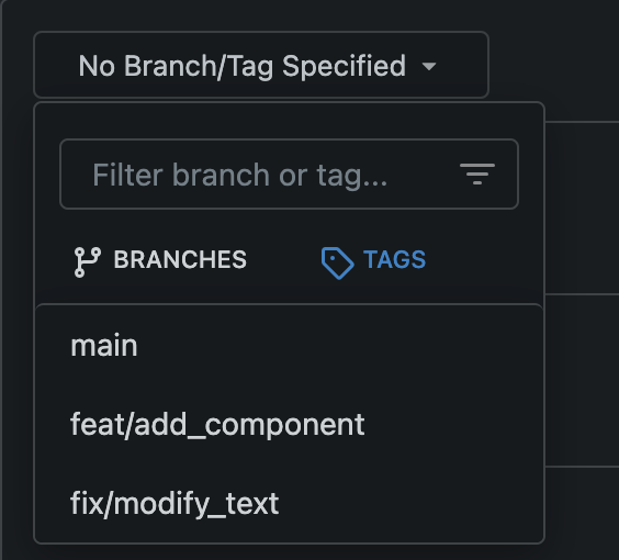
After

---------
Co-authored-by: silverwind <me@silverwind.io>
2024-03-15 11:43:10 +08:00
silverwind
94512ee062
Fix Citation modal responsiveness and clipboard copy ( #29799 )
...
The modal was broken in two ways:

- On small screens, the input box was partially hanging outside the
modal. Fixed with flexbox and increased modal width.
- The clipboard copy was not working because the modal had both
`data-clipboard-text` and `data-clipboard-target`, while we only support
one of those. Made a small tweak in clipboard as well so that it will
still fall back to target if text is empty.
2024-03-15 02:38:13 +00:00
silverwind
256a1eeb9a
Add <overflow-menu>, rename webcomponents ( #29400 )
...
1. Add `<overflow-menu>` web component
2. Rename `<gitea-origin-url>` to `<origin-url>` and make filenames
match.
<img width="439" alt="image"
src="https://github.com/go-gitea/gitea/assets/115237/2fbe4ca4-110b-4ad2-8e17-c1e116ccbd74 ">
<img width="444" alt="Screenshot 2024-03-02 at 21 36 52"
src="https://github.com/go-gitea/gitea/assets/115237/aa8f786e-dc8c-4030-b12d-7cfb74bdfd6e ">
<img width="537" alt="Screenshot 2024-03-03 at 03 05 06"
src="https://github.com/go-gitea/gitea/assets/115237/fddd50aa-adf1-4b4b-bd7f-caf30c7b2245 ">


TODO:
- [x] Check if removal of `requestAnimationFrame` is possible to avoid
flash of content. Likely needs a `MutationObserver`.
- [x] Hide tippy when button is removed from DOM.
- [x] ~~Implement right-aligned items
(https://github.com/go-gitea/gitea/pull/28976 )~~. Not going to do it.
- [x] Clean up CSS so base element has no background and add background
via tailwind instead.
- [x] Use it for org and user page.
---------
Co-authored-by: Giteabot <teabot@gitea.io>
Co-authored-by: wxiaoguang <wxiaoguang@gmail.com>
2024-03-15 02:05:31 +00:00
Denys Konovalov
e0b002a4a8
Unify search boxes ( #29530 )
...
Unify all but a few search boxes to use uniform style, uniform
translations and shared templates where possible.
Remove a few duplicated search templates, e. g. code search.
<details><summary>Example after screenshots:</summary>


</details>
Also includes #29700
Co-authored-by: 6543 <6543@obermui.de>
---------
Co-authored-by: 6543 <m.huber@kithara.com>
Co-authored-by: 6543 <6543@obermui.de>
Co-authored-by: silverwind <me@silverwind.io>
Co-authored-by: Giteabot <teabot@gitea.io>
2024-03-14 23:24:59 +00:00
Yarden Shoham
70e077036f
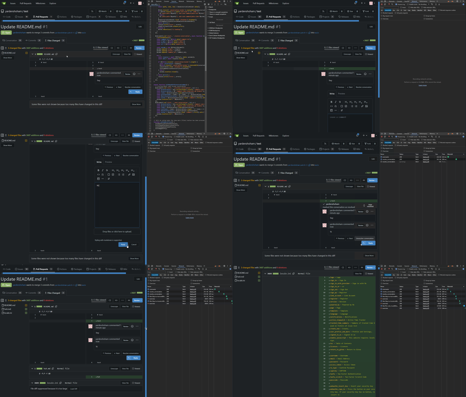
Remove jQuery AJAX from the diff functions ( #29743 )
...
- Removed all jQuery AJAX calls and replaced with our fetch wrapper
- Tested the review conversation comment, resolve, unresolve, show more
files, and load diff functionality and it works as before
# Demo using `fetch` instead of jQuery AJAX
---------
Signed-off-by: Yarden Shoham <git@yardenshoham.com>
Co-authored-by: silverwind <me@silverwind.io>
2024-03-14 22:21:14 +00:00
silverwind
35def319fd
Fix Safari spinner rendering ( #29801 )
...
Fixes: https://github.com/go-gitea/gitea/issues/29041
Fixes: https://github.com/go-gitea/gitea/pull/29713

Any of the `width: *-content` properties seem to workaround this Webkit
bug, this one seemed most suitable.
2024-03-14 22:04:33 +00:00
Yarden Shoham
0679e60c77
Remove jQuery AJAX from the repo-issue.js file ( #29776 )
...
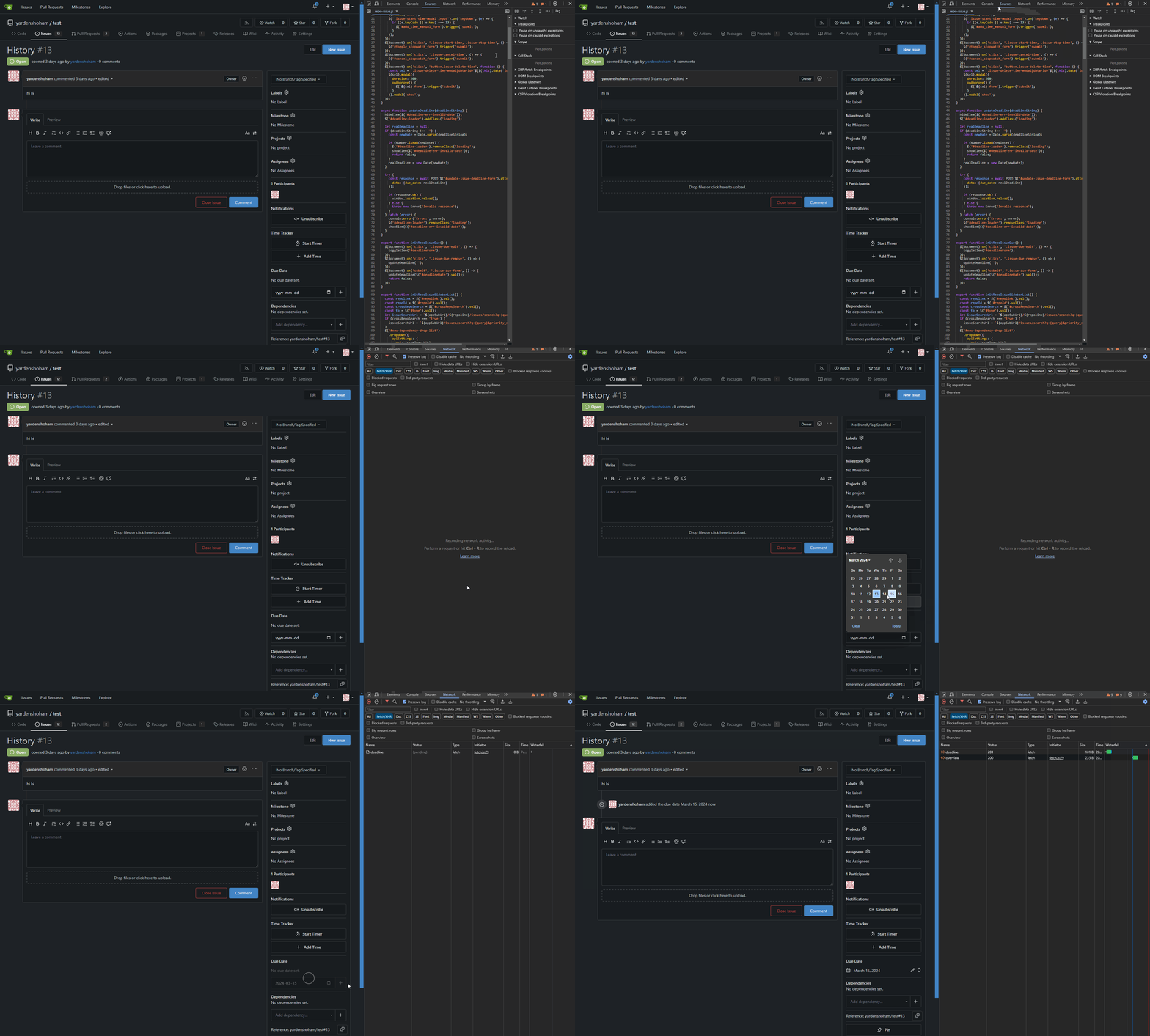
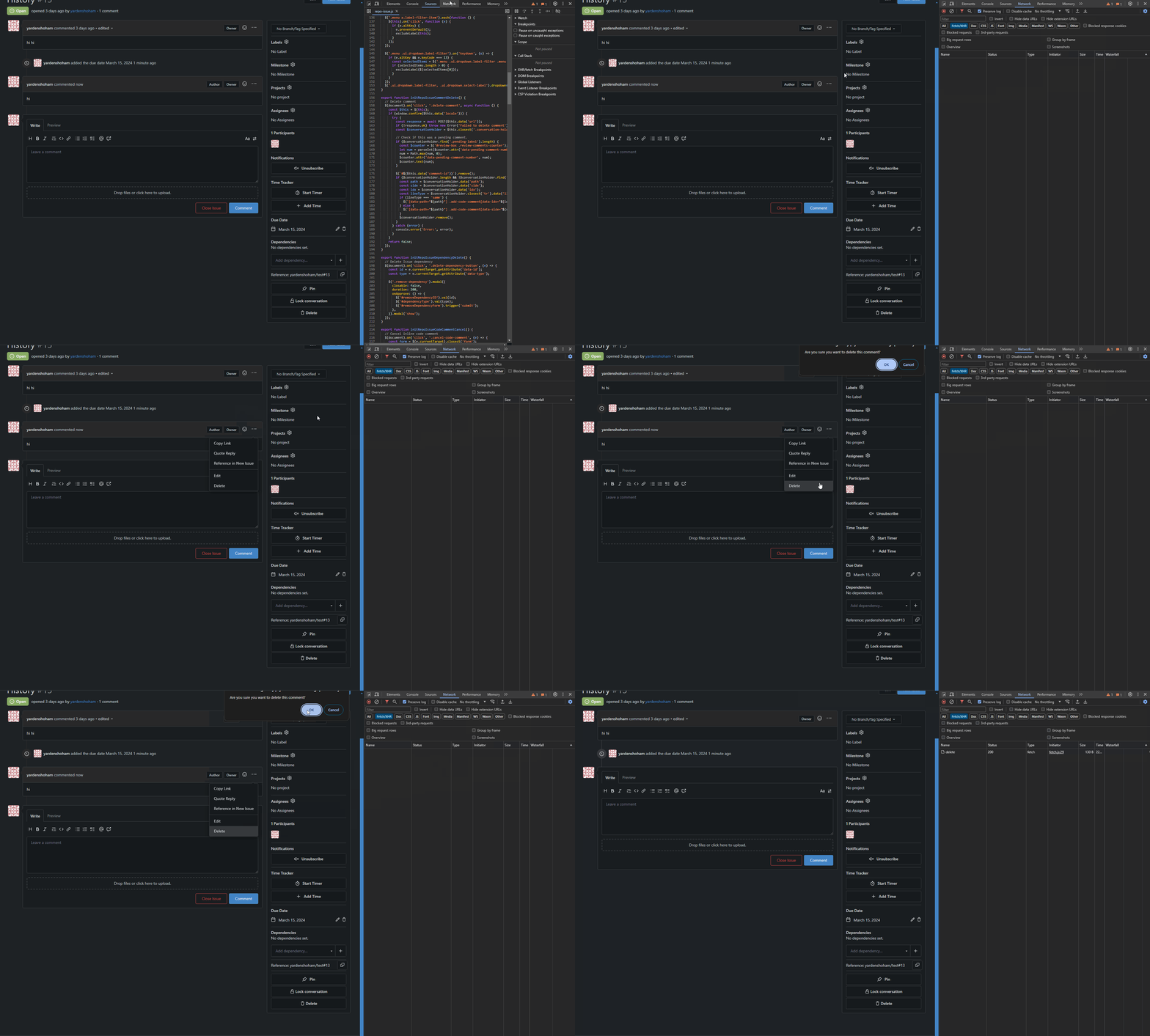
Removed all jQuery AJAX calls and replaced with our fetch wrapper.
Tested the following functionalities and they work as before:
- due-date update
- comment deletion
- branch update by merge or rebase
- allow edits from maintainers button
- reviewer addition or deletion
- WIP toggle button
- new diff code comment button
- issue title edit button
# Demo using `fetch` instead of jQuery AJAX
## Updating the due-date of an issue
## Deleting a comment
## Updating a branch in a pull request

## Checking and unchecking the "Allow edits from maintainers" checkbox

## Requesting review and removing review request
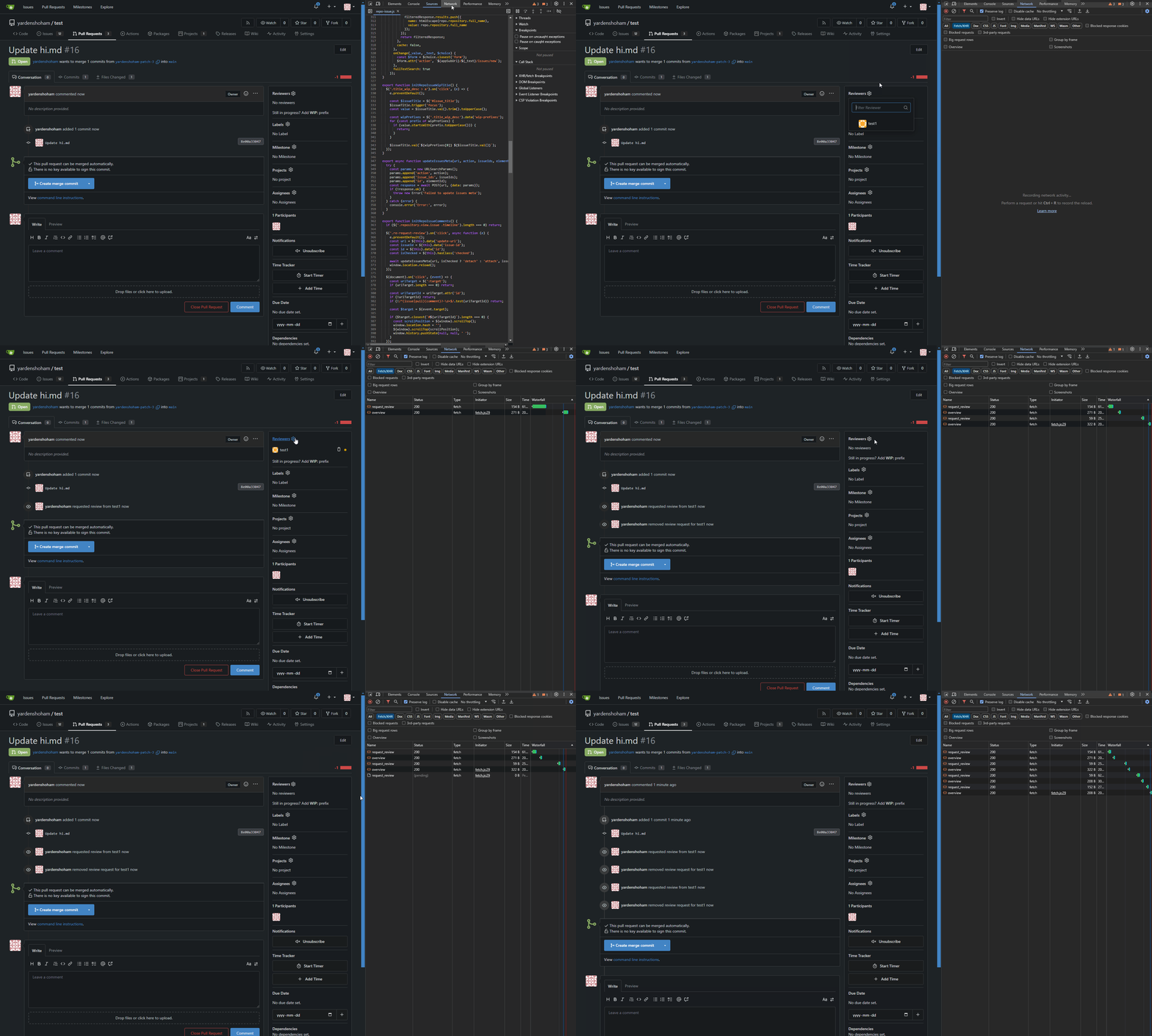
## Toggling the WIP status of a pull request

## Clicking the new code comment button on the diff page
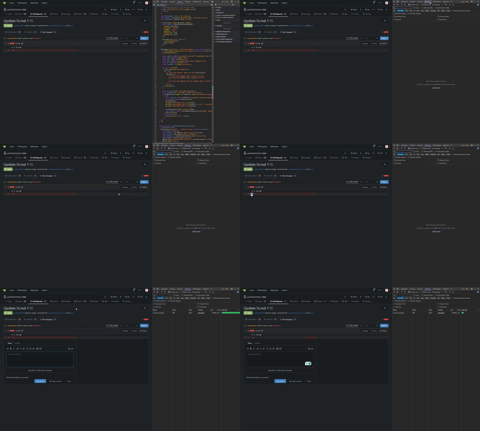
## Editing the issue title and target branch
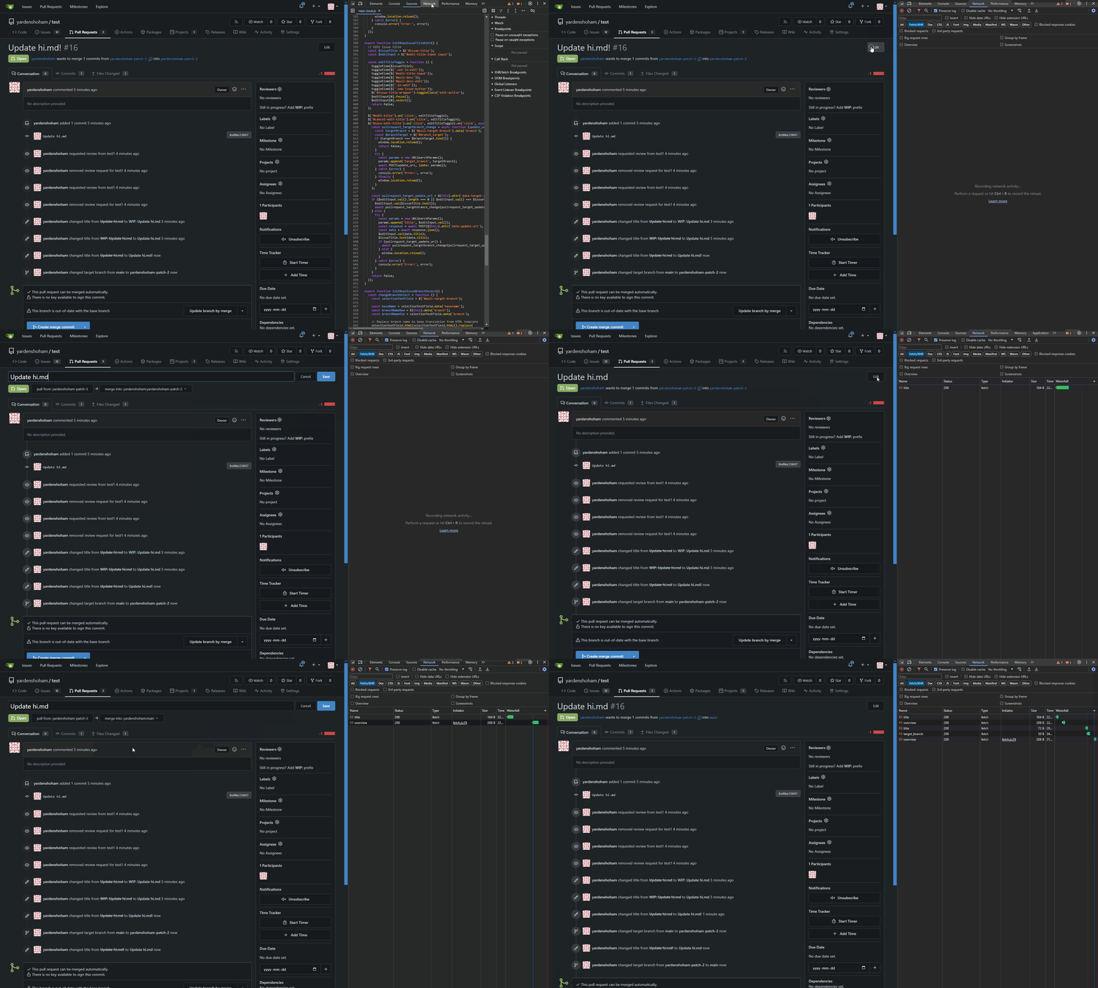
---------
Signed-off-by: Yarden Shoham <git@yardenshoham.com>
Co-authored-by: silverwind <me@silverwind.io>
2024-03-14 21:36:17 +00:00
yp05327
ce085b26fc
Improve commit record's ui in comment list ( #26619 )
...
Before:


After:


---------
Co-authored-by: silverwind <me@silverwind.io>
2024-03-14 19:01:16 +00:00
silverwind
eb8c34fc36
Tweak actions view sticky ( #29781 )
...
Add some space when the left side items are sticky due to scrolling the
right side.
<img width="419" alt="image"
src="https://github.com/go-gitea/gitea/assets/115237/292e1b03-a071-4744-bb79-e50d109056c8 ">
2024-03-14 04:30:10 +00:00
wxiaoguang
e01b0014de
Improve a11y document and dropdown item ( #29753 )
...
Co-authored-by: silverwind <me@silverwind.io>
2024-03-13 13:44:46 +00:00
silverwind
857243bed7
Fix date rendering by adding <gitea-absolute-date> ( #29725 )
...
Alternative to: https://github.com/go-gitea/gitea/pull/29698
Fixes: https://github.com/go-gitea/gitea/issues/29034
<img width="278" alt="image"
src="https://github.com/go-gitea/gitea/assets/115237/12ecd967-2723-410d-8a28-a1b0f41b7bba ">
It also fixes a secondary issue that we were showing timestamp tooltips
over date, which makes no sense, so these are now gone as well:
<img width="284" alt="image"
src="https://github.com/go-gitea/gitea/assets/115237/a70432f3-97b6-41e6-b202-b53b76924a66 ">
2024-03-12 22:37:02 +00:00
6543
36de5b299b
Highlight archived labels ( #29680 )
...
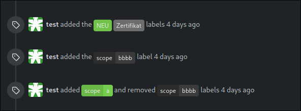
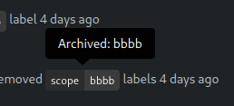
the issue is, that you can not distinguish between normal and archived
labels.
So this will make archived labels 80% **grayscale**. And prepend
"Archived: " to the tooltip info


---
*Sponsored by Kithara Software GmbH*
---------
Co-authored-by: delvh <dev.lh@web.de>
2024-03-12 17:32:05 +00:00