### Description
Fixes the organization page header layout issue where:
1. Long organization descriptions did not wrap and instead stretched the
header container out of bounds.
2. The "Follow" button floated dynamically adjacent to the description's
right edge depending on the description length, instead of remaining at
a fixed position aligned with the right edge of the page container.

Fixes https://github.com/go-gitea/gitea/issues/38445
### Cause
The flex container `<div class="flex-relaxed-list">` lacked `tw-flex-1`
(to grow to fill the container) and `tw-min-w-0` (to allow it to shrink
below its content's size). Consequently, the flex minimum width
defaulted to `min-content`, stretching the container for long unwrapped
descriptions.

### Solution
Added `tw-flex-1 tw-min-w-0` to the `<div class="flex-relaxed-list">`
container in `templates/org/header.tmpl`. This restricts the width,
enables proper text wrapping, and fixes the "Follow" button to the right
edge of the content container.

### Screenshots
Before
<img width="1300" height="615" alt="image"
src="https://github.com/user-attachments/assets/11e6ab99-b847-45ff-8bdb-8622bfeee8aa"
/>
After
<img width="1300" height="615" alt="image"
src="https://github.com/user-attachments/assets/84ac0633-b192-4be5-8226-13bfad3ab2ec"
/>

---------

Co-authored-by: wxiaoguang <wxiaoguang@gmail.com>
Purpose:

1. Make the whole code base have unified "item" layout
2. Clarify our "list" styles: "flex-relaxed-list", "flex-divided-list"
3. Prepare to replace legacy "ui relaxed list"
* https://github.com/go-gitea/gitea/pull/37445#discussion_r3144458865
4. Prepare for refactoring the "pull merge box", it needs the
"flex-divided-list"
    * related to "Refactor pull request view (*)" like #37451
5. Fix legacy abuses of "flex-list", e.g.: repo home sidebar
1. make our "route group pattern match" also update chi's RoutePattern
2. fix incorrect "NotFound" call in conda package
3. make ".flex-item .flex-item-main" has a general gap, then no need to
use `tw` tricks
4. improve the "test webhook" UI
Forbid
[deprecated](https://drafts.csswg.org/css-text-3/#word-break-property)
`break-word` and fix all occurences.

Regarding `overflow-wrap: break-word` vs `overflow-wrap: anywhere`:

Example of difference: https://jsfiddle.net/silverwind/1va6972r/

[Here](https://stackoverflow.com/questions/77651244) it says:

> The differences between normal, break-word and anywhere are only clear
if you are using width: min-content on the element containing the text,
and you also set a max-width. A pretty rare scenario.

I don't think this difference will make any practical impact as we are
not hitting this rare scenario.
We have to define this one in helpers.css because tailwind only
generates a single class but certain things rely on this being
double-class. Command ran:

```sh
perl -p -i -e 's#gt-hidden#tw-hidden#g' web_src/js/**/* templates/**/* models/**/* web_src/css/**/*

---------

Co-authored-by: wxiaoguang <wxiaoguang@gmail.com>
Align everything with a new layout.

* Use "baseline" for some special elements, the "flex-item-icon" is for
the issue list only at the moment and I think it should be general
enough now (but not using "flex-item-leading" anymore in this case).
* Make the labels stretch themselves.
1. There is already `gt-ac`, so no need to introduce `flex-item-center`
2. The `flex-item-baseline` and `.flex-item-icon svg { margin-top: 1px
}` seem to be a tricky patch, they don't resolve the root problem, and
still cause misalignment in some cases.
* The root problem is: the "icon" needs to align with the sibling
"title"
* So, make the "icon" and the "title" both have the same height
3. `flex-text-inline` could only be used if the element is really
"inline", otherwise its `vertical-align` would make the box size change.
In most cases, `flex-text-block` is good enough.

---------
Co-authored-by: silverwind <me@silverwind.io>
Co-authored-by: Giteabot <teabot@gitea.io>
1. In many cases, the `flex-list` has previous and next `gt-hidden`
siblings, so relax the CSS selector to remove all ".segument .flex-list"
paddings.
2. Make the "Add key" button can toggle
3. Move help message into the related segment(panel). Otherwise users
would misread the message, eg: the SSH help seemed for GPG because they
are so near
4. Move modal element into the segment element, otherwise it affects the
layout
Replace #26761
It's better to keep children elements simple, and let parent containers
layout the necessary padding/margin.
The old `not(:last-child)` and `.flex-item + .flex-item` are not easy to
maintain (for example, what if the developer would like to use a "tiny
height" item?)
The old approach also makes some UI look strange because the first item
doesn't have proper padding-top.
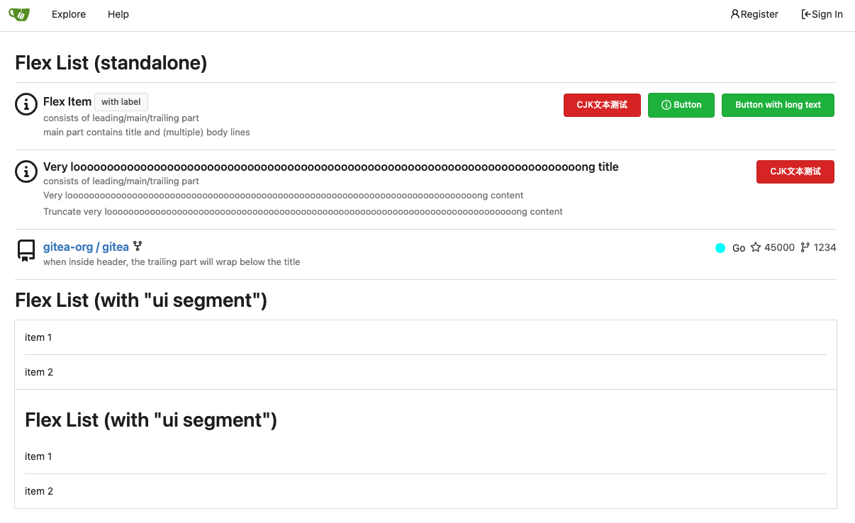
In this PR, we just simply use `.flex-item { padding: ... }`:
* Developers could manually set the item height they want easily
* It's easier to make it work with various containers -- with padding
(`ui segment`) and without padding (`div`)
And added more samples/examples.
Co-authored-by: Giteabot <teabot@gitea.io>
Fix#26617
1. Separate the "flex-list" examples into a dedicated template, and add some more examples
2. Use `flex-basis` instead of `flex-shrink` for `flex-item-trailing`, to avoid wrapping the texts too aggressively
3. Some `flex-wrap: wrap;` are removed


