0
0
mirror of https://github.com/go-gitea/gitea.git synced 2024-11-28 04:08:25 +01:00
gitea/web_src
yp05327 8703b6c954
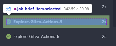
Improve clickable area in repo action view page (#26115)
Before:

![image](https://github.com/go-gitea/gitea/assets/18380374/52e4dda1-0221-440b-93e1-242db8bd5885)
After:

![image](https://github.com/go-gitea/gitea/assets/18380374/dda5e72b-205e-44f7-b4a9-83703021f2d1)

In current design, the clickable area is too small, and it is hard to
find the correct clickable area as the area with background color (div
with class name `job-brief-item selected`) is bigger than it.

---------

Co-authored-by: Giteabot <teabot@gitea.io>
2023-08-16 00:44:43 +02:00
..
css
fomantic
js Improve clickable area in repo action view page (#26115) 2023-08-16 00:44:43 +02:00
svg Use inline SVG for built-in OAuth providers (#25171) 2023-06-13 10:51:02 +00:00