mirror of
https://github.com/go-gitea/gitea.git
synced 2025-10-31 11:41:32 +01:00
 256a1eeb9a
1. Add `<overflow-menu>` web component 2. Rename `<gitea-origin-url>` to `<origin-url>` and make filenames match. <img width="439" alt="image" src="https://github.com/go-gitea/gitea/assets/115237/2fbe4ca4-110b-4ad2-8e17-c1e116ccbd74"> <img width="444" alt="Screenshot 2024-03-02 at 21 36 52" src="https://github.com/go-gitea/gitea/assets/115237/aa8f786e-dc8c-4030-b12d-7cfb74bdfd6e"> <img width="537" alt="Screenshot 2024-03-03 at 03 05 06" src="https://github.com/go-gitea/gitea/assets/115237/fddd50aa-adf1-4b4b-bd7f-caf30c7b2245">  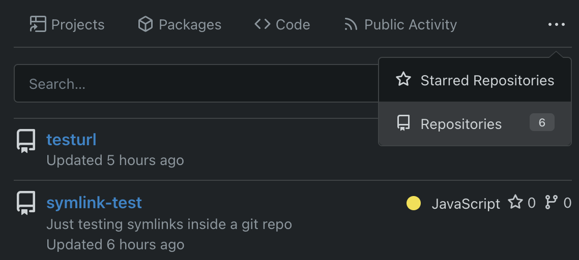 TODO: - [x] Check if removal of `requestAnimationFrame` is possible to avoid flash of content. Likely needs a `MutationObserver`. - [x] Hide tippy when button is removed from DOM. - [x] ~~Implement right-aligned items (https://github.com/go-gitea/gitea/pull/28976)~~. Not going to do it. - [x] Clean up CSS so base element has no background and add background via tailwind instead. - [x] Use it for org and user page. --------- Co-authored-by: Giteabot <teabot@gitea.io> Co-authored-by: wxiaoguang <wxiaoguang@gmail.com>
88 lines
1.7 KiB
CSS
88 lines
1.7 KiB
CSS
.fork-flag {
|
|
margin-top: 0.5rem;
|
|
font-size: 12px;
|
|
}
|
|
|
|
.repo-header {
|
|
display: flex;
|
|
flex-flow: row wrap;
|
|
justify-content: space-between;
|
|
gap: 0.5rem;
|
|
}
|
|
|
|
.repo-header .flex-item {
|
|
padding: 0;
|
|
}
|
|
|
|
.repo-header .btn.interact-bg:hover {
|
|
text-decoration: none;
|
|
}
|
|
|
|
.repo-header .flex-item-main {
|
|
flex-basis: unset;
|
|
}
|
|
|
|
.repo-header .flex-item-trailing {
|
|
flex-wrap: nowrap;
|
|
}
|
|
|
|
.repo-header .flex-item-trailing .repo-icon {
|
|
display: none;
|
|
}
|
|
|
|
.repo-buttons {
|
|
align-items: center;
|
|
display: flex;
|
|
flex-flow: row wrap;
|
|
word-break: keep-all;
|
|
gap: 0.25em;
|
|
}
|
|
|
|
.repo-buttons .ui.labeled.button > .label:hover {
|
|
color: var(--color-primary-light-2);
|
|
background: var(--color-light);
|
|
}
|
|
|
|
.repo-buttons button[disabled] ~ .label {
|
|
opacity: var(--opacity-disabled);
|
|
color: var(--color-text-dark);
|
|
background: var(--color-light-mimic-enabled) !important;
|
|
}
|
|
|
|
.repo-buttons button[disabled] ~ .label:hover {
|
|
color: var(--color-primary-dark-1);
|
|
}
|
|
|
|
.repo-buttons .ui.labeled.button.disabled {
|
|
pointer-events: inherit !important;
|
|
}
|
|
|
|
.repo-buttons .ui.labeled.button.disabled > .label {
|
|
color: var(--color-text-dark);
|
|
background: var(--color-light-mimic-enabled) !important;
|
|
}
|
|
|
|
.repo-buttons .ui.labeled.button.disabled > .label:hover {
|
|
color: var(--color-primary-dark-1);
|
|
}
|
|
|
|
.repo-buttons .ui.labeled.button.disabled > .button {
|
|
pointer-events: none !important;
|
|
}
|
|
|
|
.repository .header-wrapper {
|
|
background-color: var(--color-header-wrapper);
|
|
}
|
|
|
|
@media (max-width: 767.98px) {
|
|
.repo-header .flex-item {
|
|
flex-grow: 1;
|
|
}
|
|
.repo-header .flex-item-trailing .label {
|
|
display: none;
|
|
}
|
|
.repo-header .flex-item-trailing .repo-icon {
|
|
display: initial;
|
|
}
|
|
}
|